Hard Truths
In the context of the George Floyd protests and Black Lives Matter movement, Axios created a series of Deep Dives covering systemic racism in the U.S. We designed a new storytelling format for this project.
YEAR: 2020
MY ROLE: Product designer
CREDITS: Al Lucca (VP of design), Miranda Leung (brand designer), Kasiana McLenaghan (senior product manager)
LIVE: axios.com
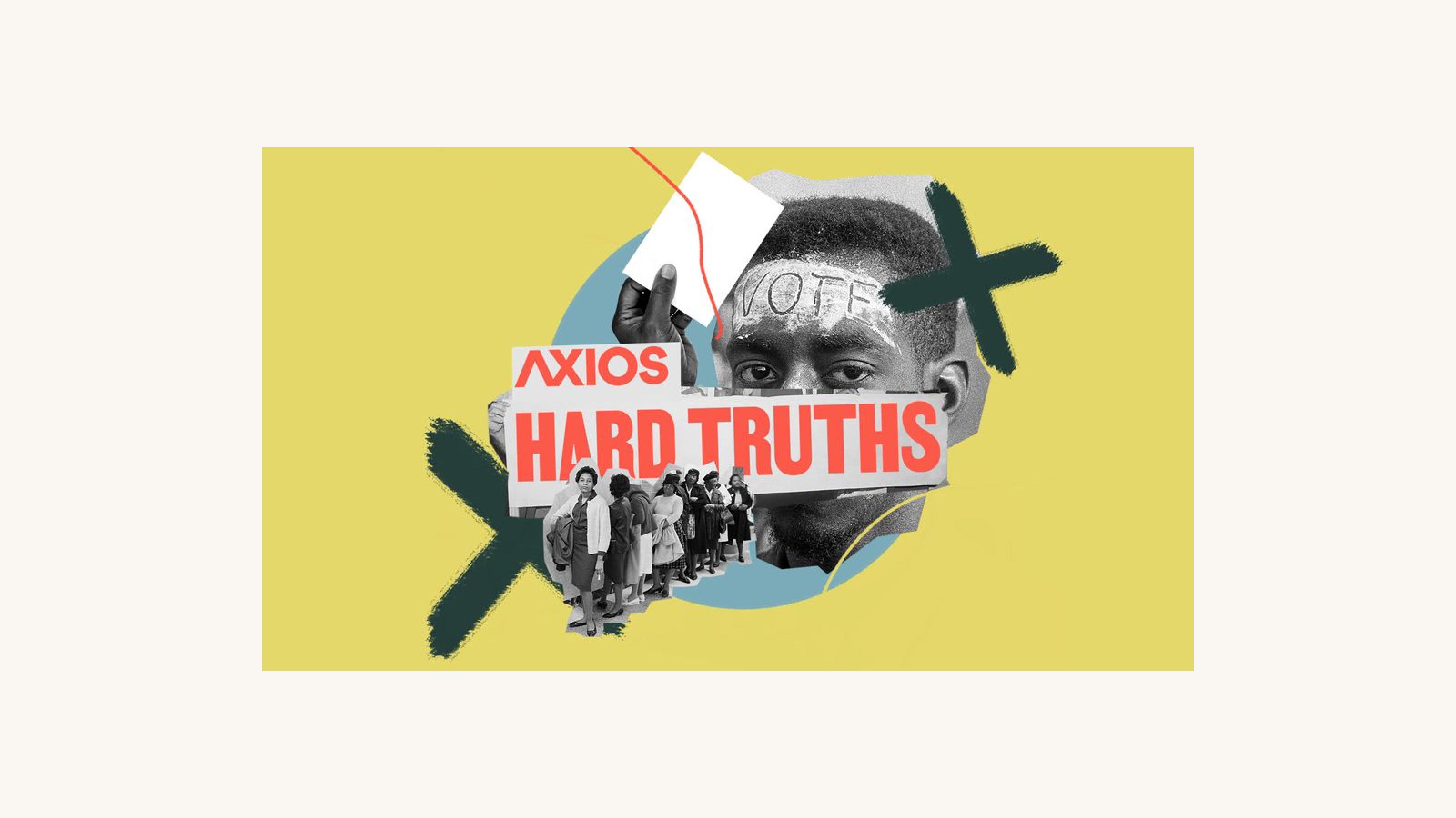
Illustration by Sarah Grillo.
The Problem
Reporting on systemic racism in the U.S. tends to ebb and flow with public attention. Mainstream media often produce one-off “special” reports on the subject – a format unable to capture the full history and nuance of the problem. How might Axios create reporting on systemic racism that endures, providing historical context and a coherent narrative?
Discovery
I kicked off the project by talking with Axions from various corners of the company about the project’s context and potential impact. I also gathered examples of storytelling about race, and then brought this research to the rest of the product and brand design team for a sketching exercise.
Go deeper: View my guide to our design team ideation session.
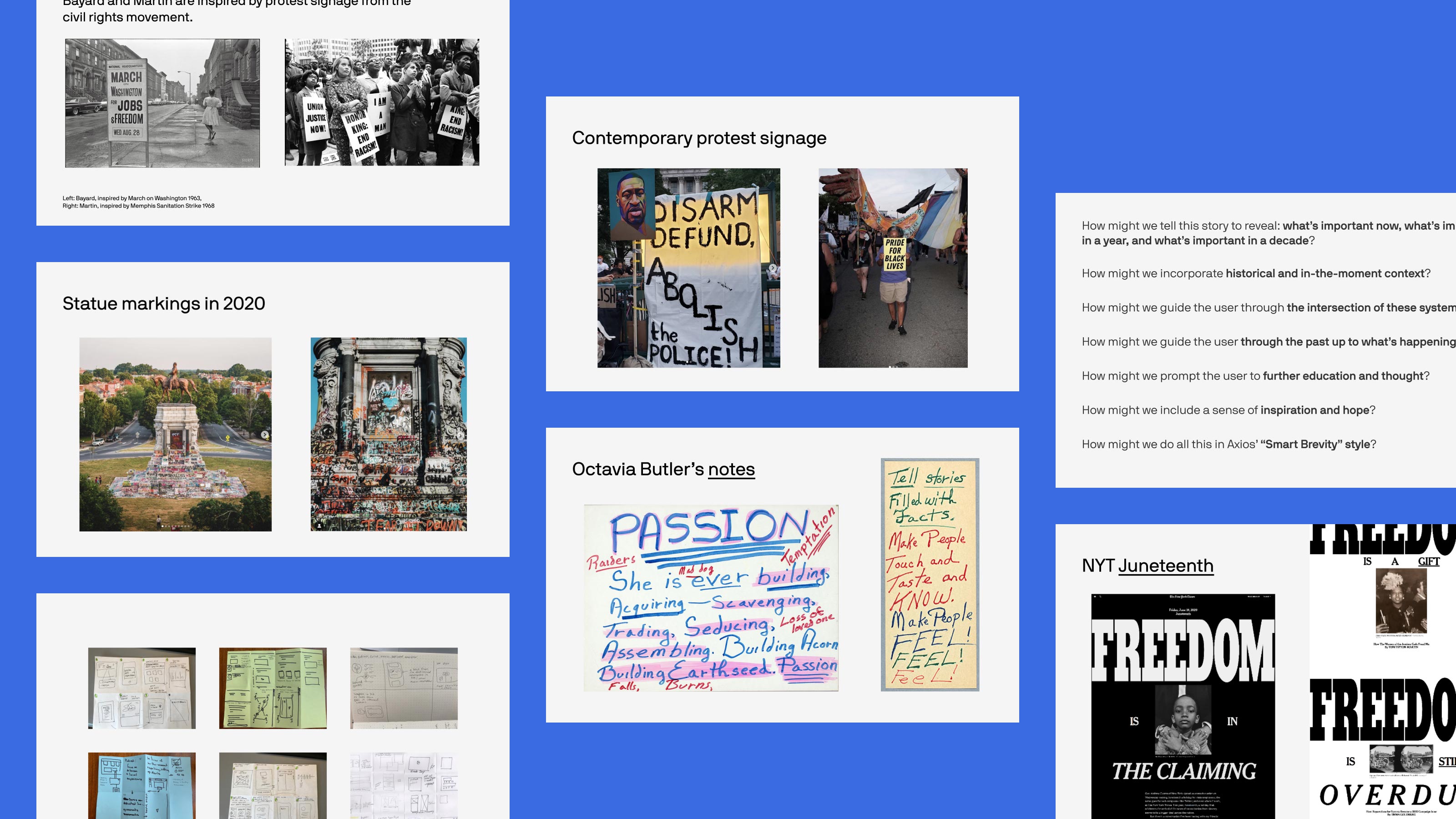
Inspiration and sketches.
Branding
The brand design team found inspiration in protest signage and contemporary statue graffiti. They also explored more uplifting directions, inspired by Black artists and brands, and considered ways to center the work of Black designers. We arrived at a color palette derived from our brand colors and inspired by the Black Liberation flag, and a typeface created by a Black type designer and inspired by remnants of the Memphis Sanitation Strike of 1968.
Headline typeface: Martin by Vocal Type.
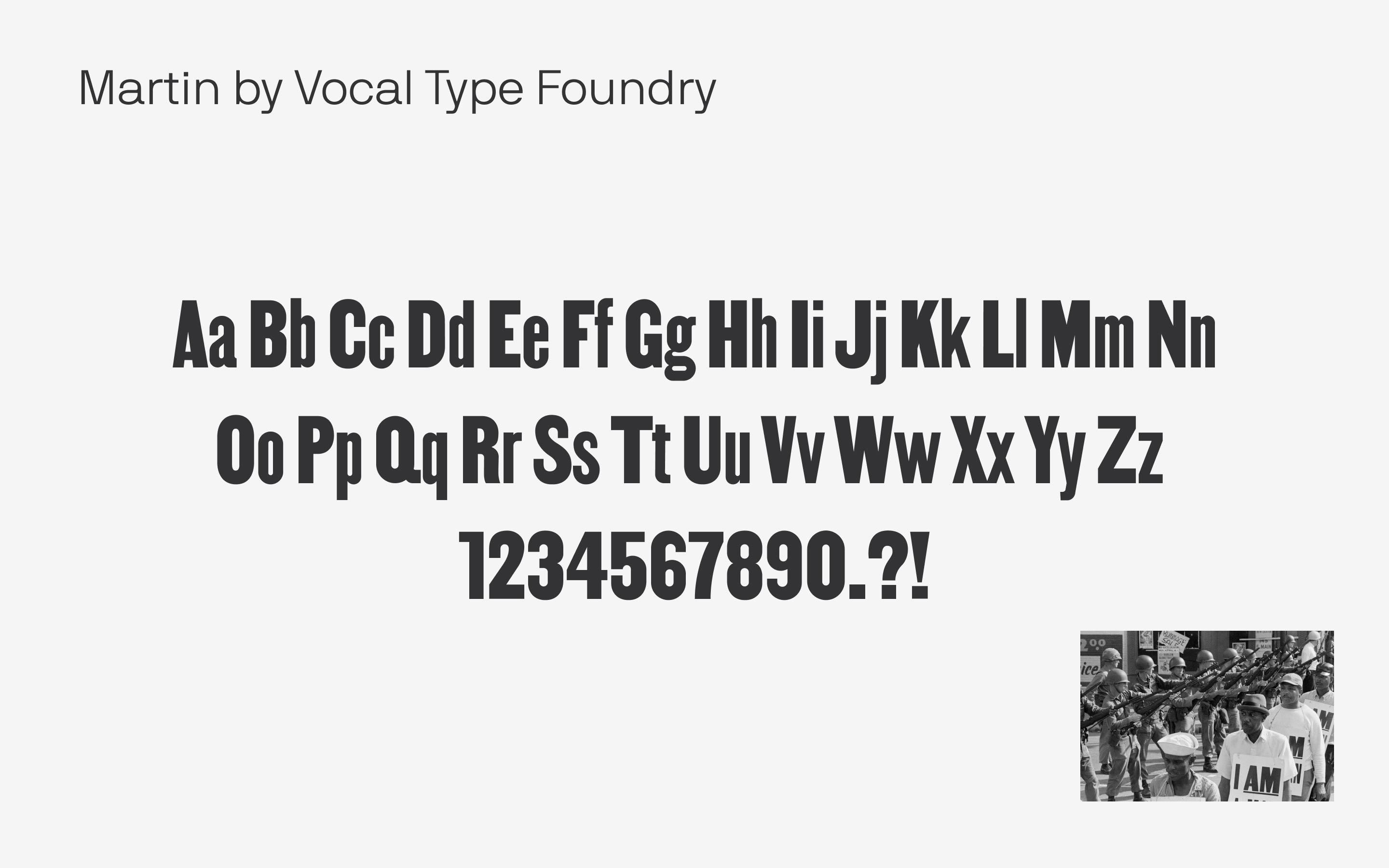
Headline type: Created by Tre Seals, a Black type designer, and inspired by protest signage. (Credit: Miranda Leung.)
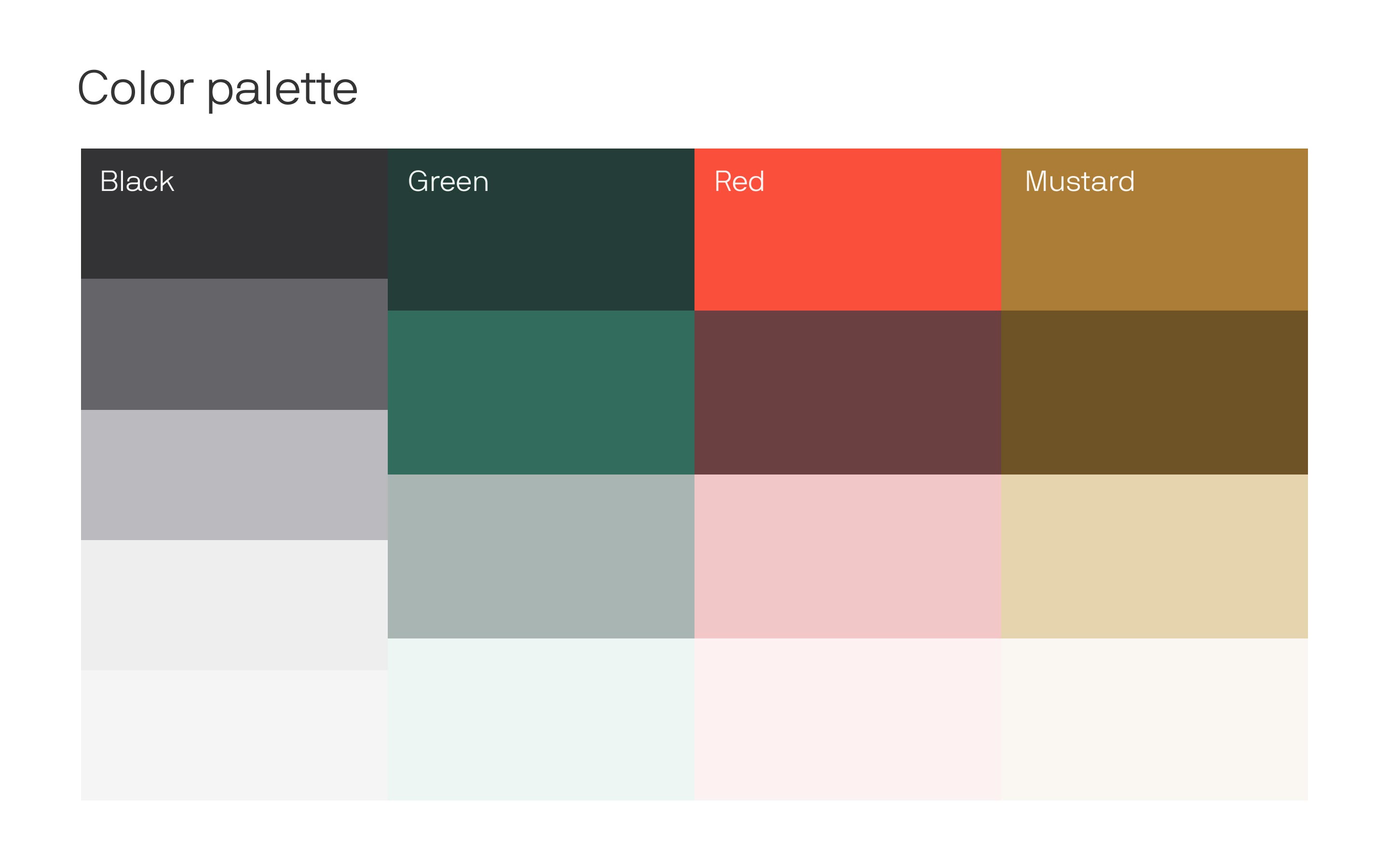
Core colors: Derived from our brand colors and inspired by the Black Liberation flag. (Credit: Miranda Leung.)
Hard Truths logo: I led design-thinking exercises to define the name of the series. (Credit: Miranda Leung.)
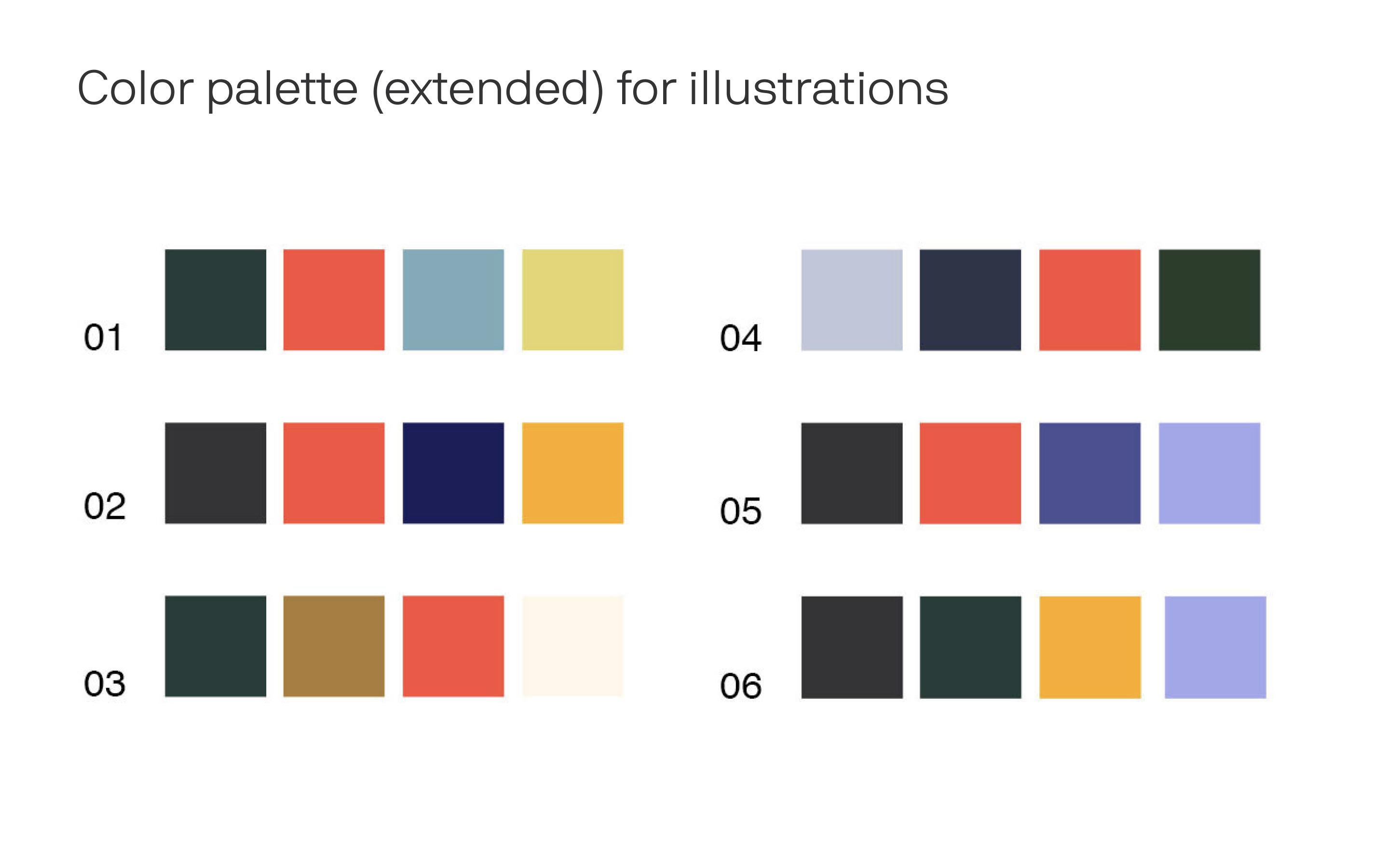
Extended colors: Expanded by our illustrations team for each Deep Dive in the series. (Credit: Sarah Grillo.)
Design-led
This project marked the first at Axios (at least in our tenure) in which product design, brand design, illustration, data visualization and editorial ideas evolved simultaneously. It showed other teams that design can add more than “icing on the cake” at the end of a project; it can create strategic and conceptual value.
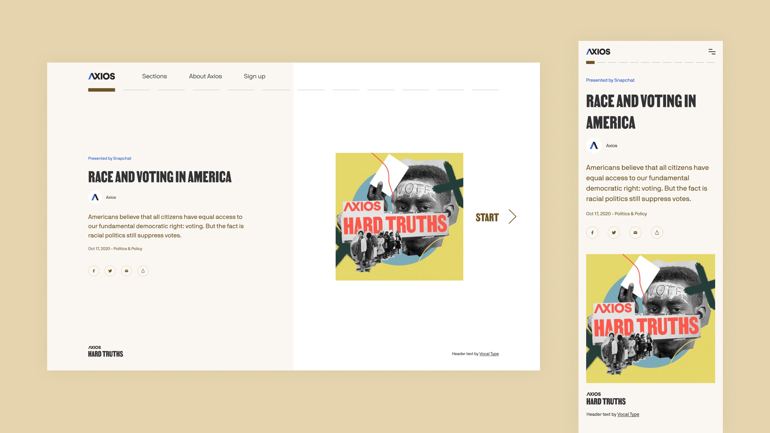
Hard Truths Deep Dive cover page.
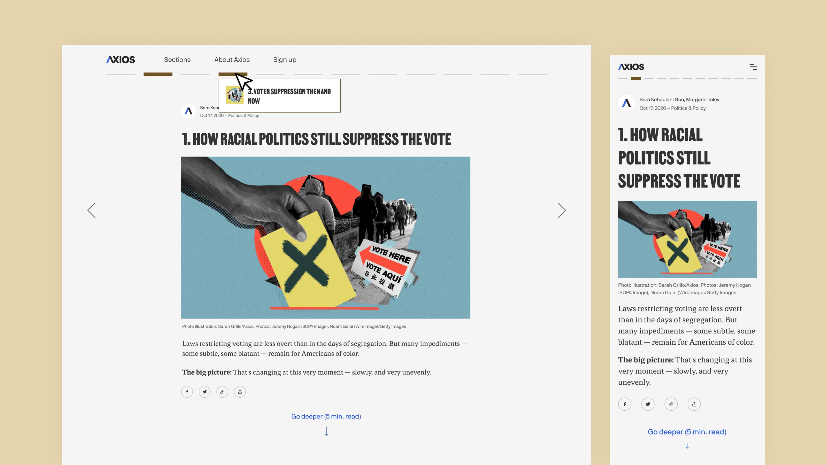
Hard Truths Deep Dive story page.
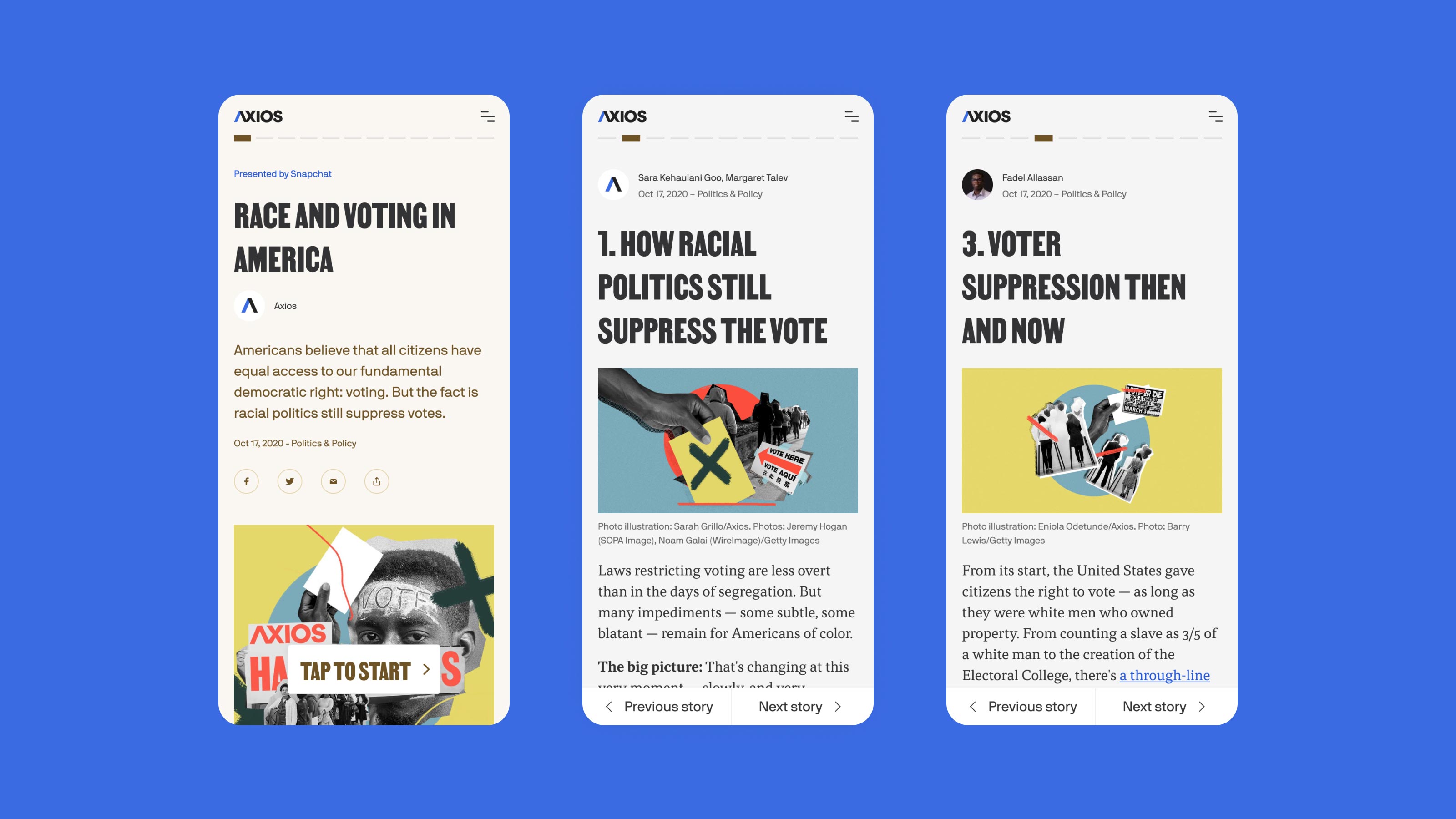
Hard Truths Deep Dive mobile navigation.
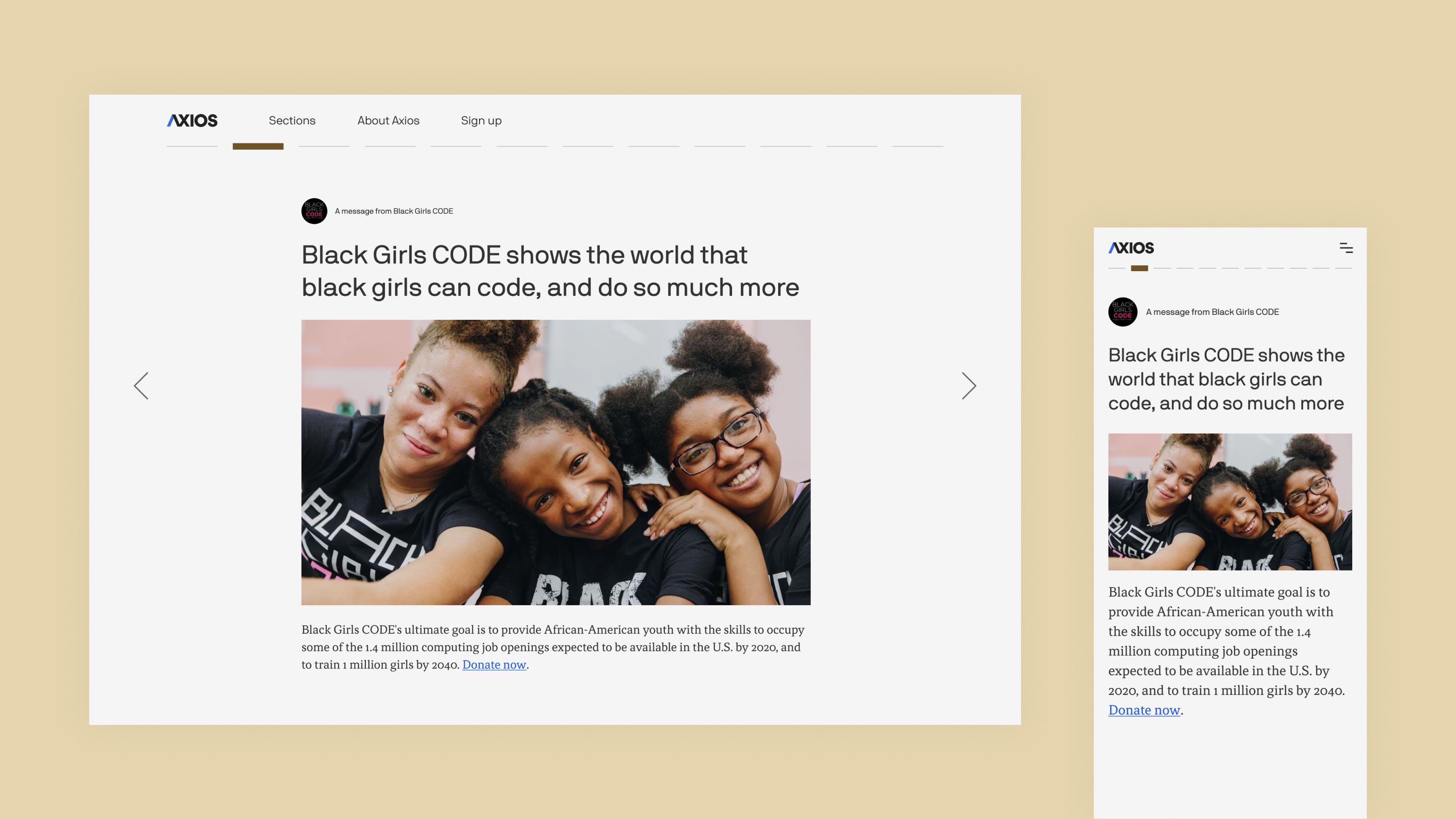
Hard Truths Deep Dive ad page: We proposed featuring Black-owned businesses and nonprofits as sponsors.
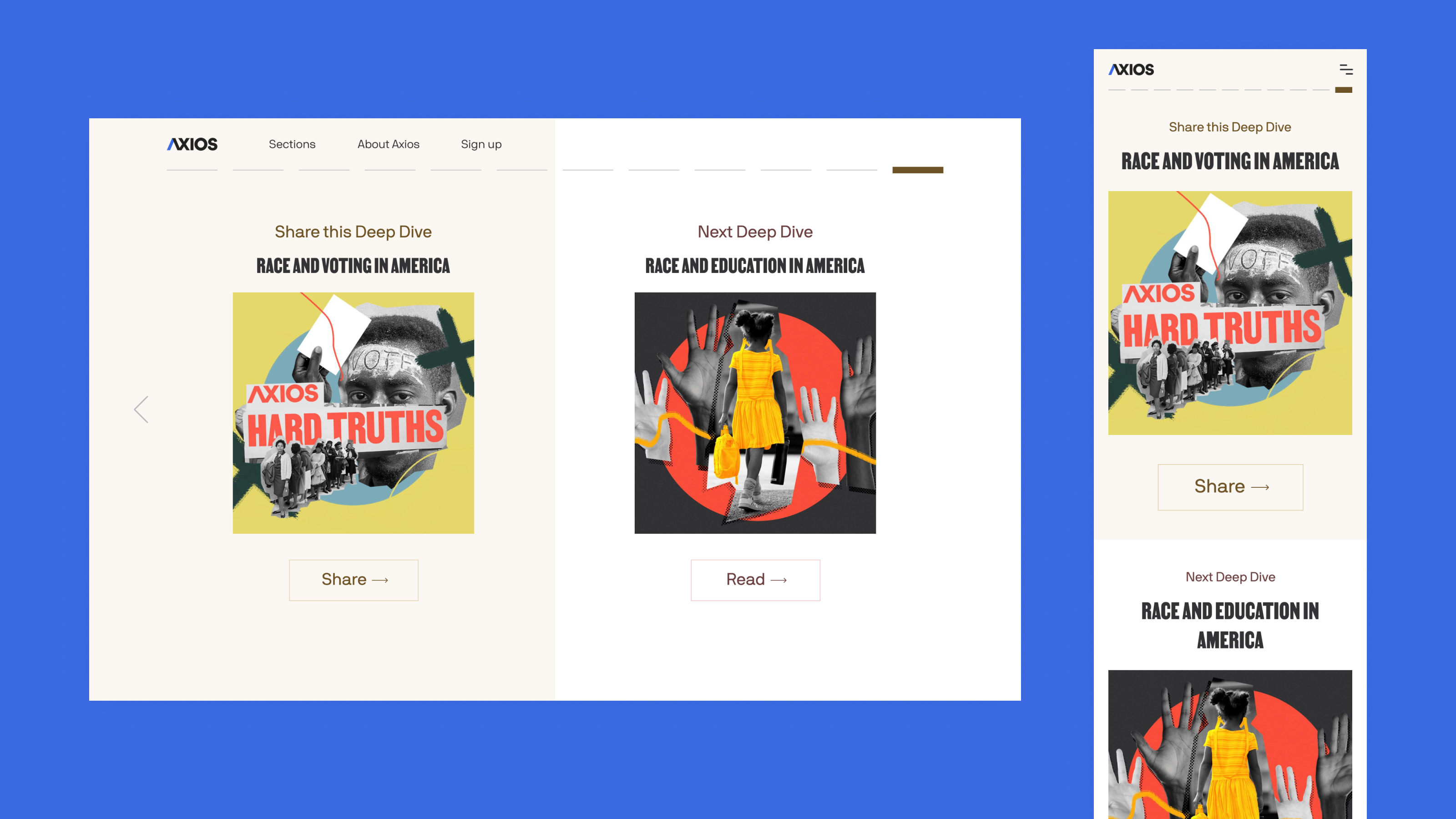
Hard Truths Deep Dive back cover page.
A Lasting Format
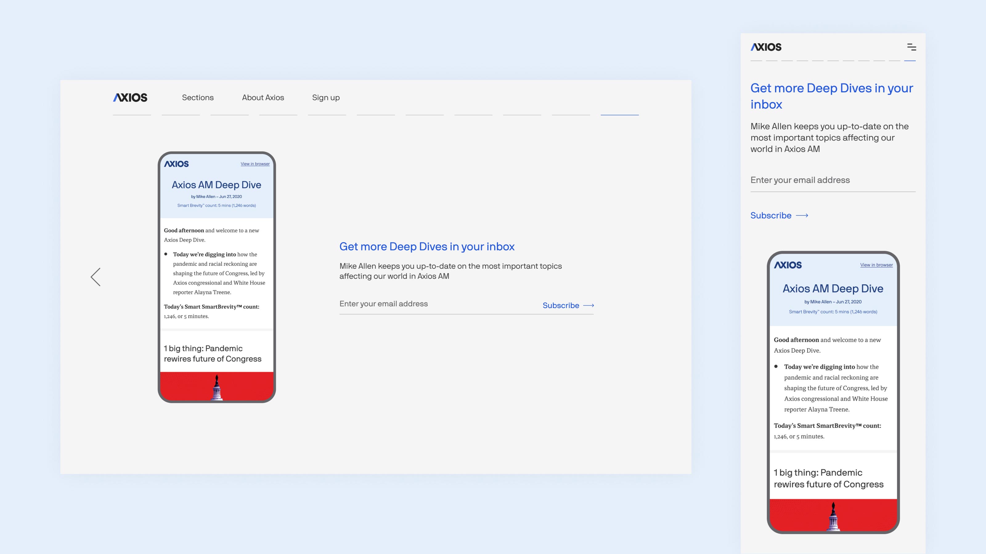
As much as the Hard Truths project demanded a special visual treatment, our business leaders didn’t want to spend engineering resources on a bespoke design during a pandemic. I created an experience for our standard Deep Dives, a format used by editorial to explore any subject in more depth, to apply to Hard Truths. We incorporated the highest-impact and lowest-effort branding elements (color and typography) into the standard format to differentiate Hard Truths.
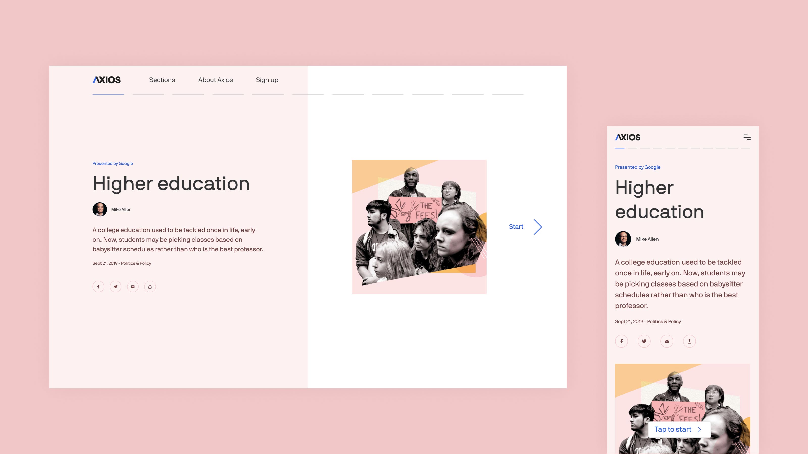
Standard Deep Dive cover page.
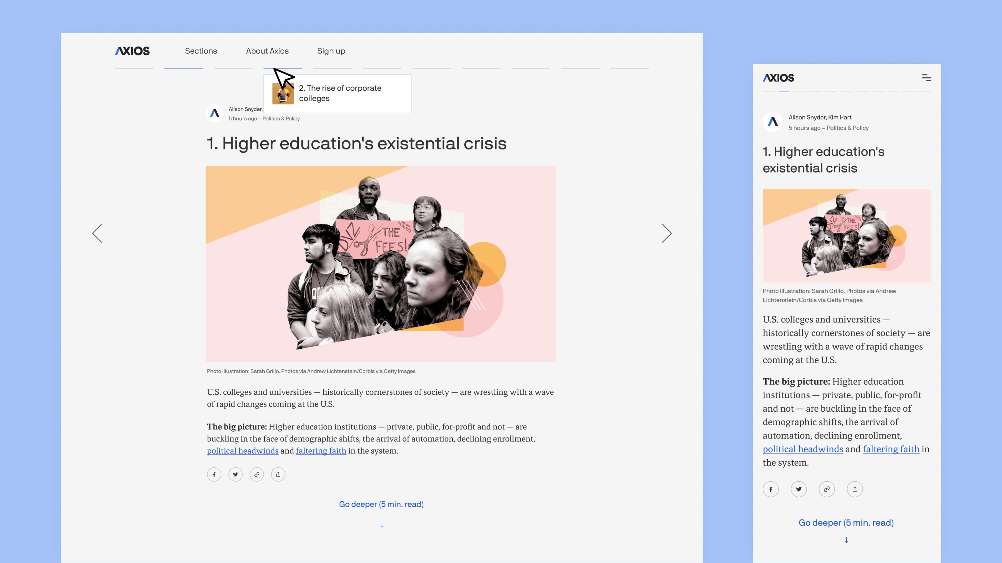
Standard Deep Dive story page.
