Personalizing The Atlantic
We explored customization and personalization features to encourage readers to form deeper habits with The Atlantic’s journalism.
YEAR: 2021-2022
MY ROLE: Senior product designer
CREDITS: Jim Quindlen (executive director of product design), Mollie Leavitt (audience research manager), Jody Mak (senior product manager)
ORIGINALLY PUBLISHED: building.theatlantic.com
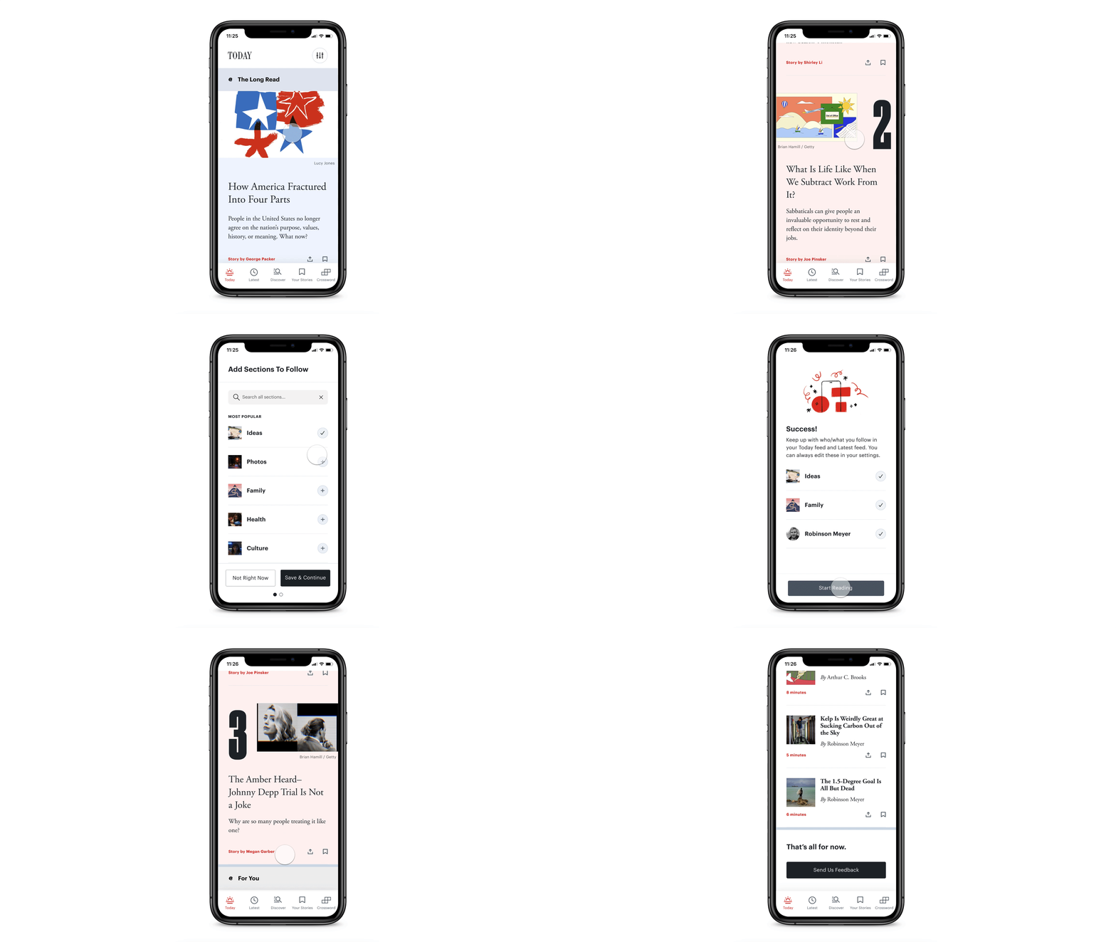
Imagining a customized app experience.
The Opportunity
At The Atlantic, we know that readers turn to us for our editorial judgment, trusting our editors to curate our journalism for them. Our newsroom isn’t bound to the daily news cycle; we cover the most important stories and look for trends in the news across a longer timeframe.
At the same time, we know that our readers have their own favorite writers and topics, and perhaps the most valuable version of The Atlantic balances these two needs. We can create a dynamic experience that helps our readers to connect with the stories that they’re already interested in, without getting away from the value of curation.
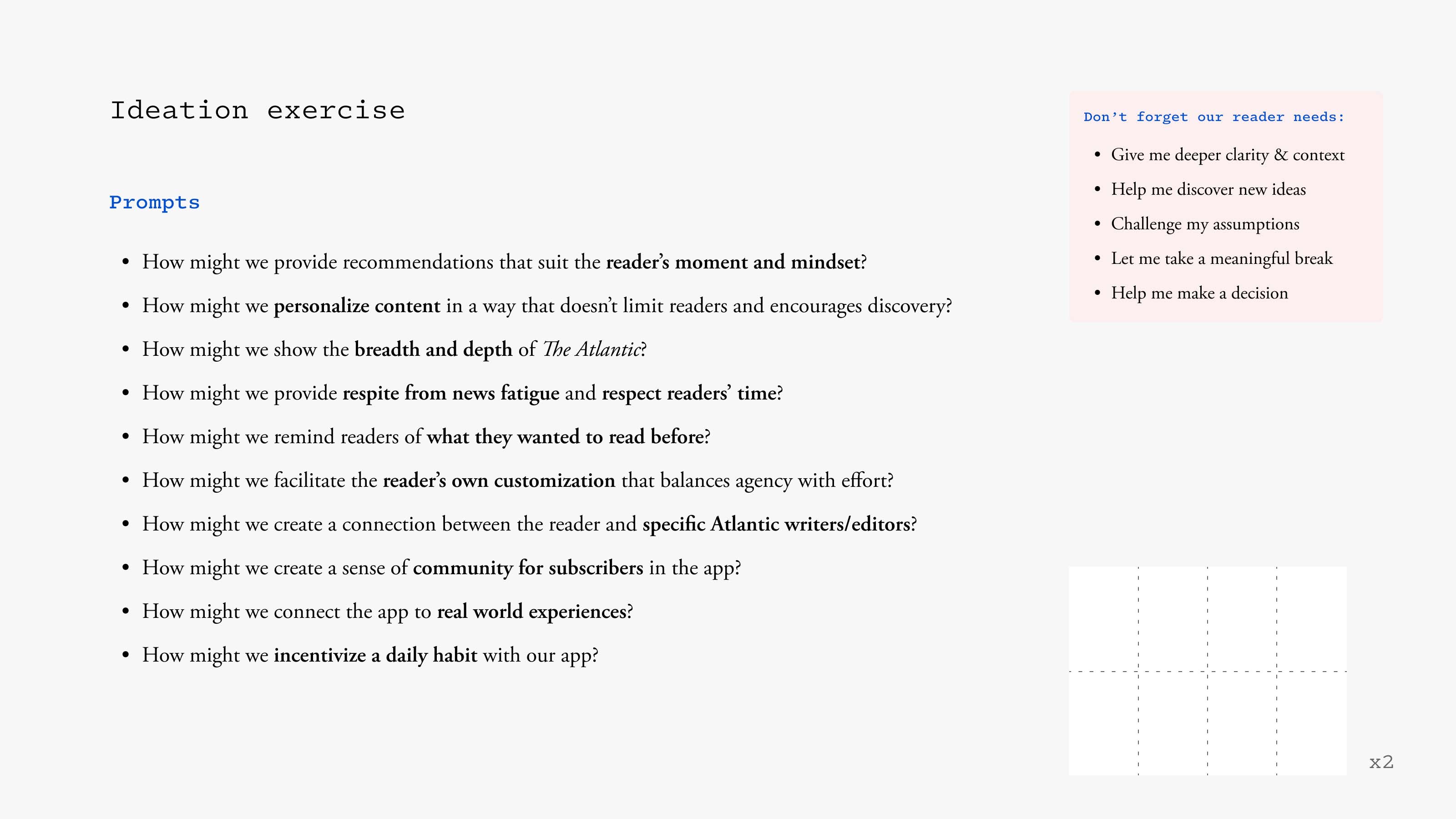
We started to brainstorm around this opportunity with editors, product managers, and designers.
Our Framework
As we tested early designs with readers both familiar with and new to The Atlantic, we began to notice patterns in how readers want to find their next story. I worked with our audience researcher, Mollie Leavitt, to define three different preferences: curation, customization and personalization.
As predicted, we learned that The Atlantic products already serve readers who value editorial curation. These readers trust our editors to recommend the most important ideas and conversations of our time, as well as stories that they wouldn’t necessarily seek out on their own – all within a finite and complete experience. The Atlantic Daily newsletter and our app’s Today feed – both of which offer a short list (in different formats) of The Atlantic’s best reads of the day – serve these readers well.
But many other readers expect a more personally relevant experience – featuring topics, writers, and stories they’re already interested in. Both customization and personalization offer a means to providing a more personally relevant experience to readers, but we discovered that each addresses slightly different motivations. A reader may prefer customization (when she chooses her own experience to meet her own need, like following a favorite writer) if she wants more agency in determining what stories she sees. Another reader may prefer personalization (when an algorithm chooses his experience to meet his anticipated need, like suggesting a new writer to follow based on who he already follows) if he prefers the “magic” feel of an algorithm making frictionless suggestions.
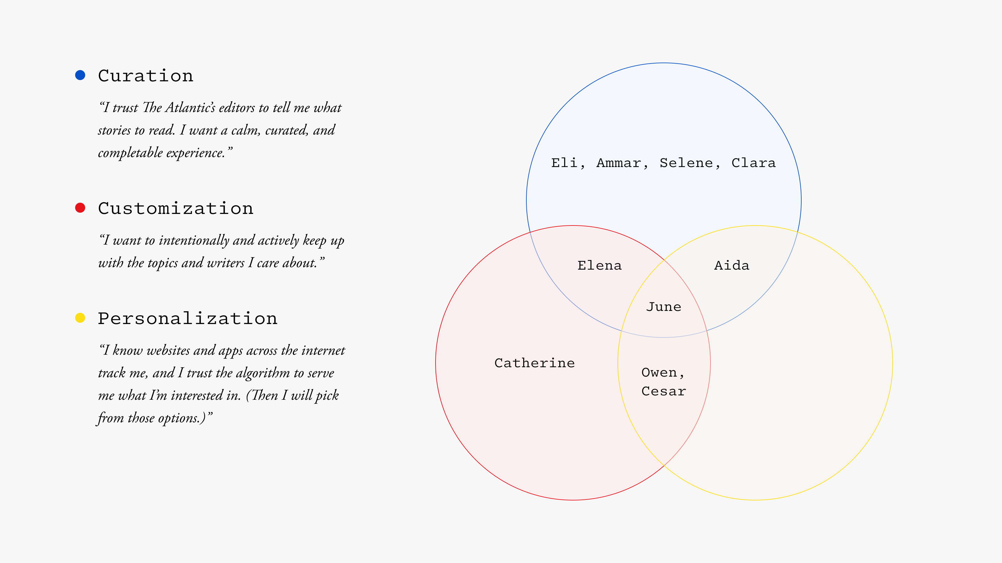
Our story recommendation framework. Readers can shift between these preferences depending on their context and may have multiple preferences. (Names have been changed.)
In expanding our product strategy to serve readers who value a personalized experience, we don’t want to diminish or replace our editorial curation; we want to complement it with customization and personalization. The last thing we want to do is lose readers’ trust by creating an echo chamber solely optimized for engagement. This means asking ourselves questions like:
- How might we show stories that are relevant to everyone alongside stories that are relevant to you personally?
- How might we introduce you to a story that you may not choose on your own, while ensuring that you don’t miss out on a story that you’re already interested in?
- How might we create a complete experience that respects your time and doesn’t overwhelm you, while avoiding redundancy or a feeling of “I’ve already seen this”?
- How might we respect your privacy while getting to know you better when you judge this relationship to be worthwhile?
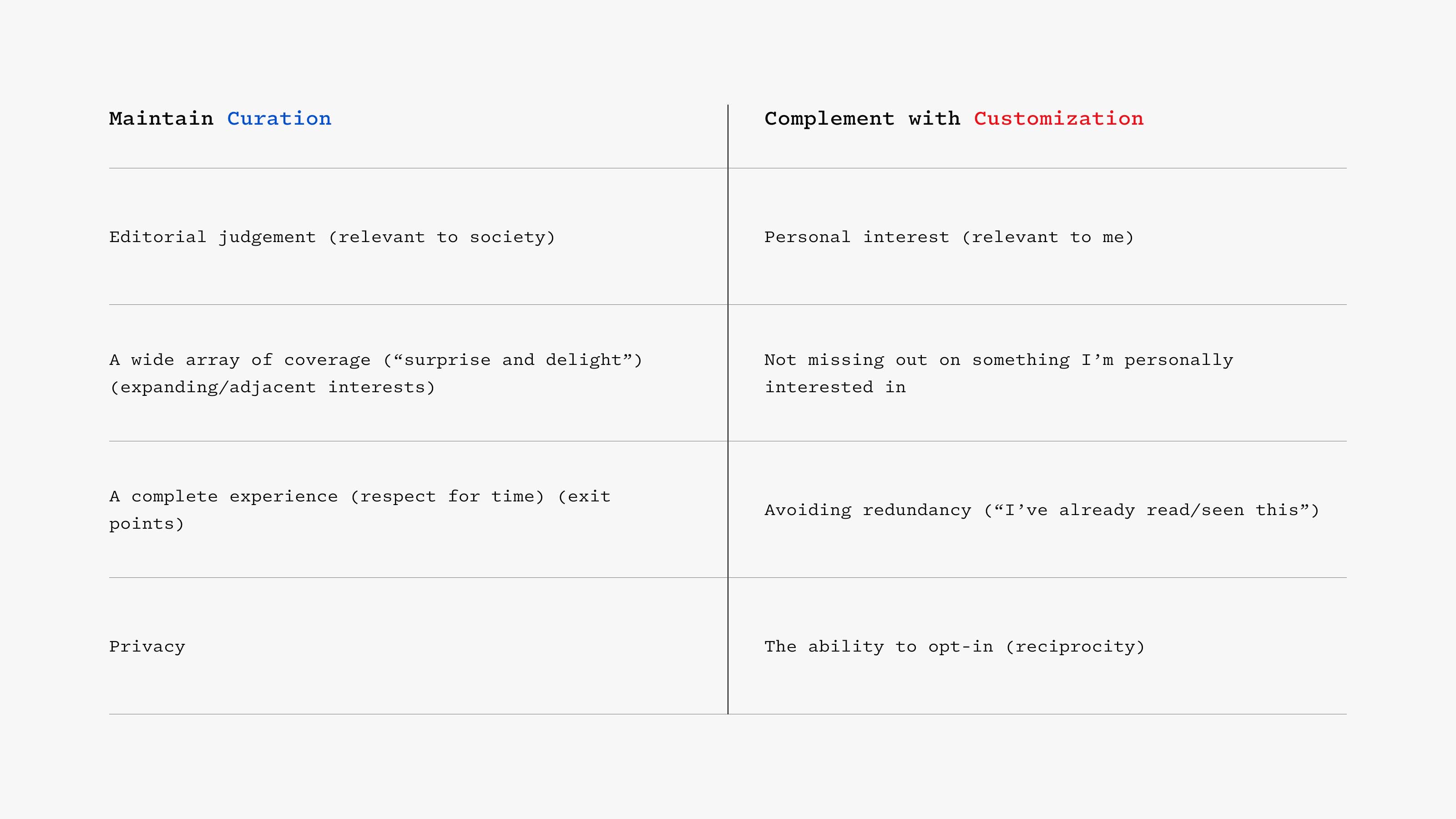
Our research-based design goals for introducing customization.
Keep Up With Your Interests
The Atlantic launched our award-winning iOS app in 2019, and we credit much of that launch’s success to the app’s reimagined home screen: a unique Today feed that feels like a daily edition of a mini-magazine. As you might expect, this approach (giving readers a short list of The Atlantic’s best reads of the day, as chosen by our app editors) is a hit for readers who value editorial curation. A recent email from one such reader:
“I love the simplicity of the Today screen!! And how you scroll vertically, only seeing one piece at a time. Please don’t make it like the home screen page of NYTimes or anything resembling an Instagram grid with too much content. You get so much credibility for carefully selecting 5-6 articles each day!!”
We’ve also received the exact opposite feedback. For some readers, the app’s Today feed feels irrelevant to them personally. One reader told us that she’s a big fan of our parenting coverage, but it rarely qualifies as a top story. She finds that Facebook, a platform that gets to know her and her interests over time, actually better connects her with The Atlantic’s latest parenting story than any of our own products.
She’s right. We have expert coverage of all sorts of topics that aren’t always the most urgent news of the moment. The challenge is connecting readers with these specific stories. Currently, they feel like they’re missing out on some of this coverage. With that in mind, we’re exploring a feature to allow readers to customize their app experience by following writers and topics, which then surface in the Today feed and throughout the rest of the app alongside editorially curated stories.
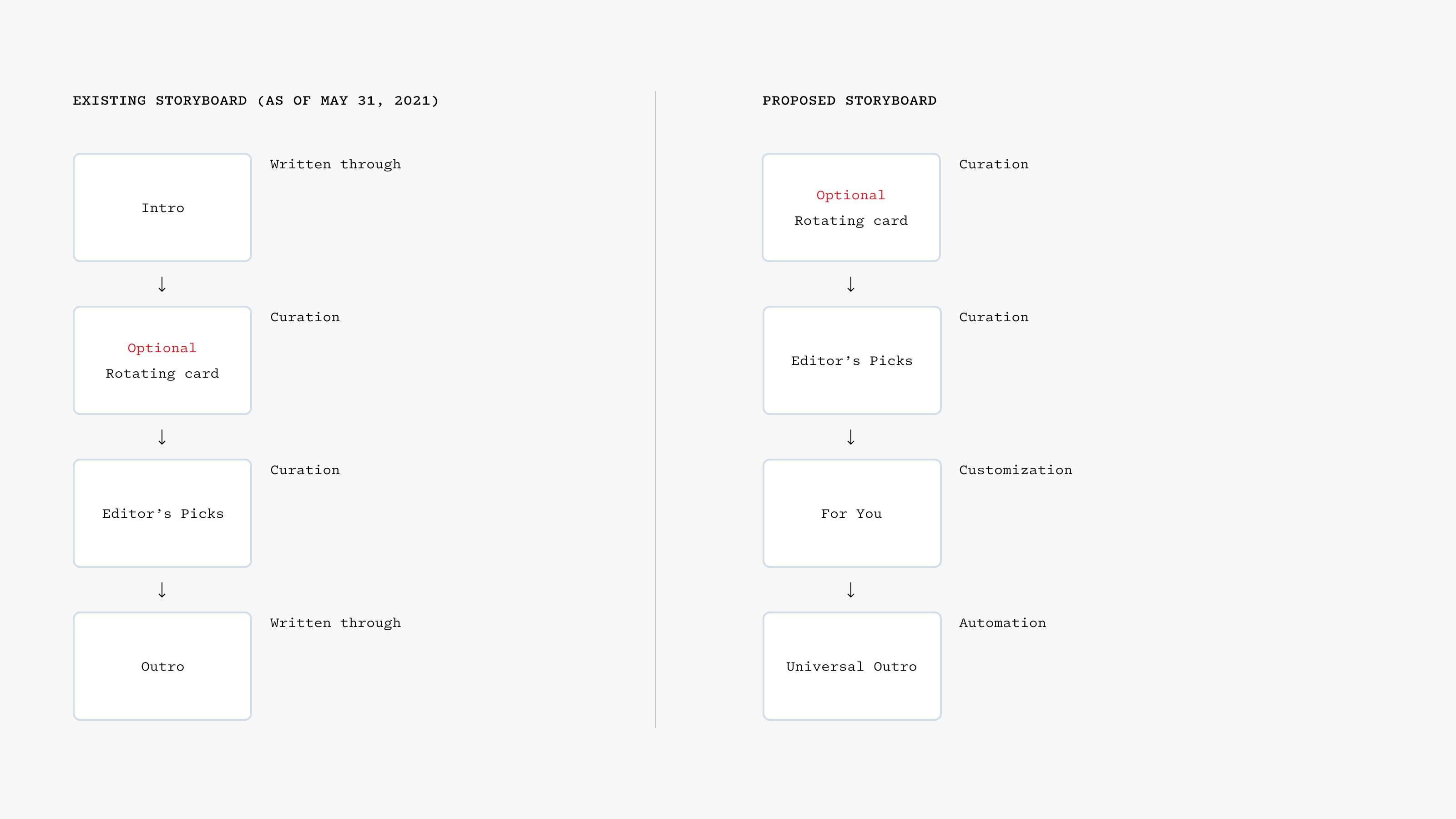
Today feed storyboards: Introducing customization (and later personalization) in the storyboard on the right.
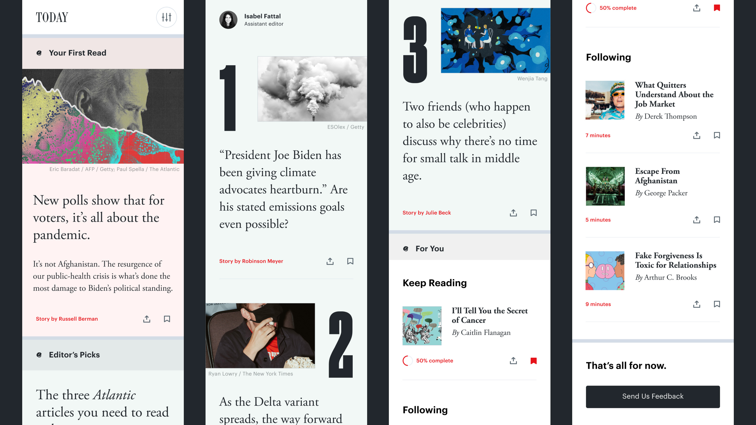
The new Today feed with a dynamic "For You" module.
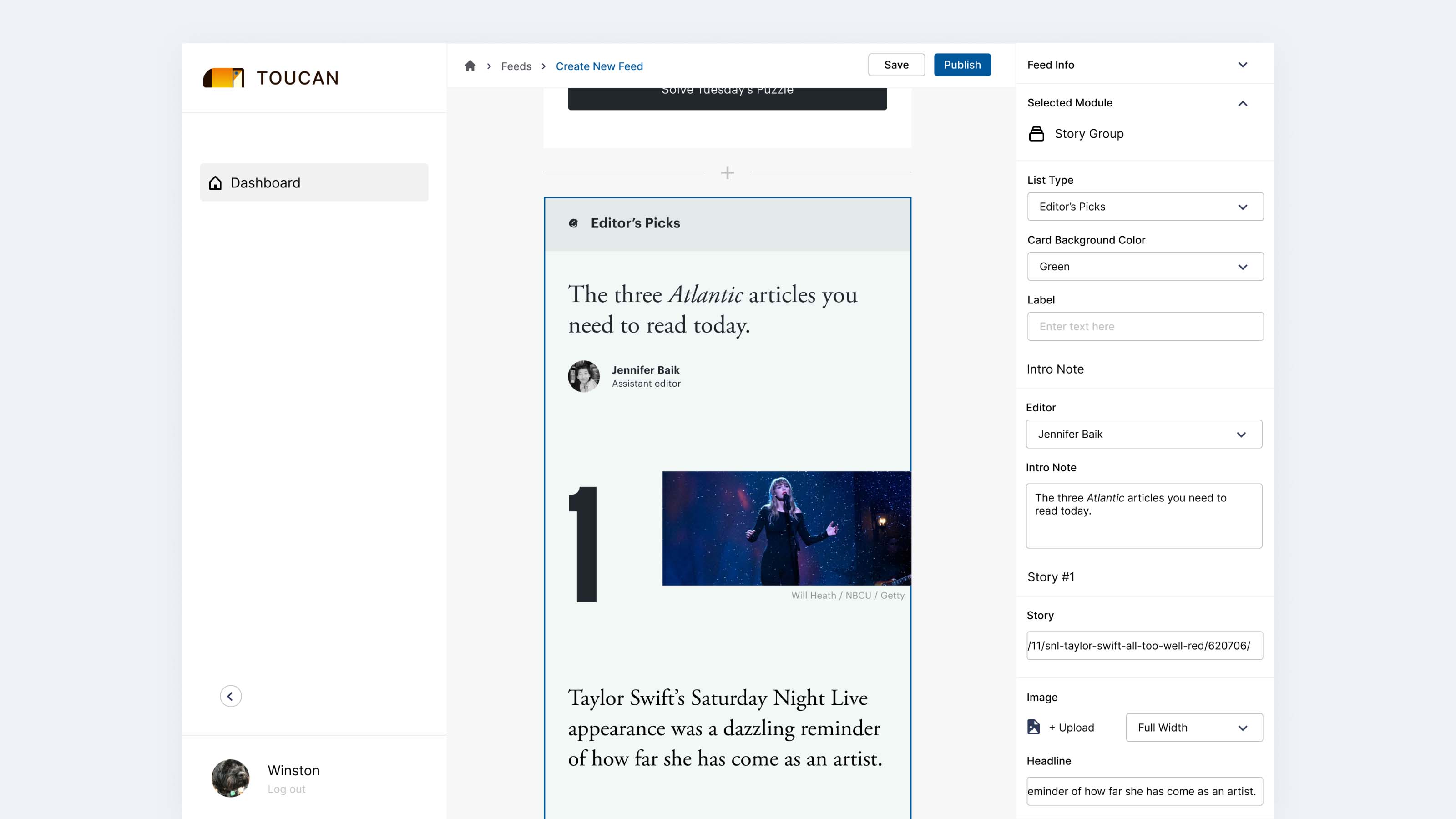
Editing the new Today feed in our CMS workflow.
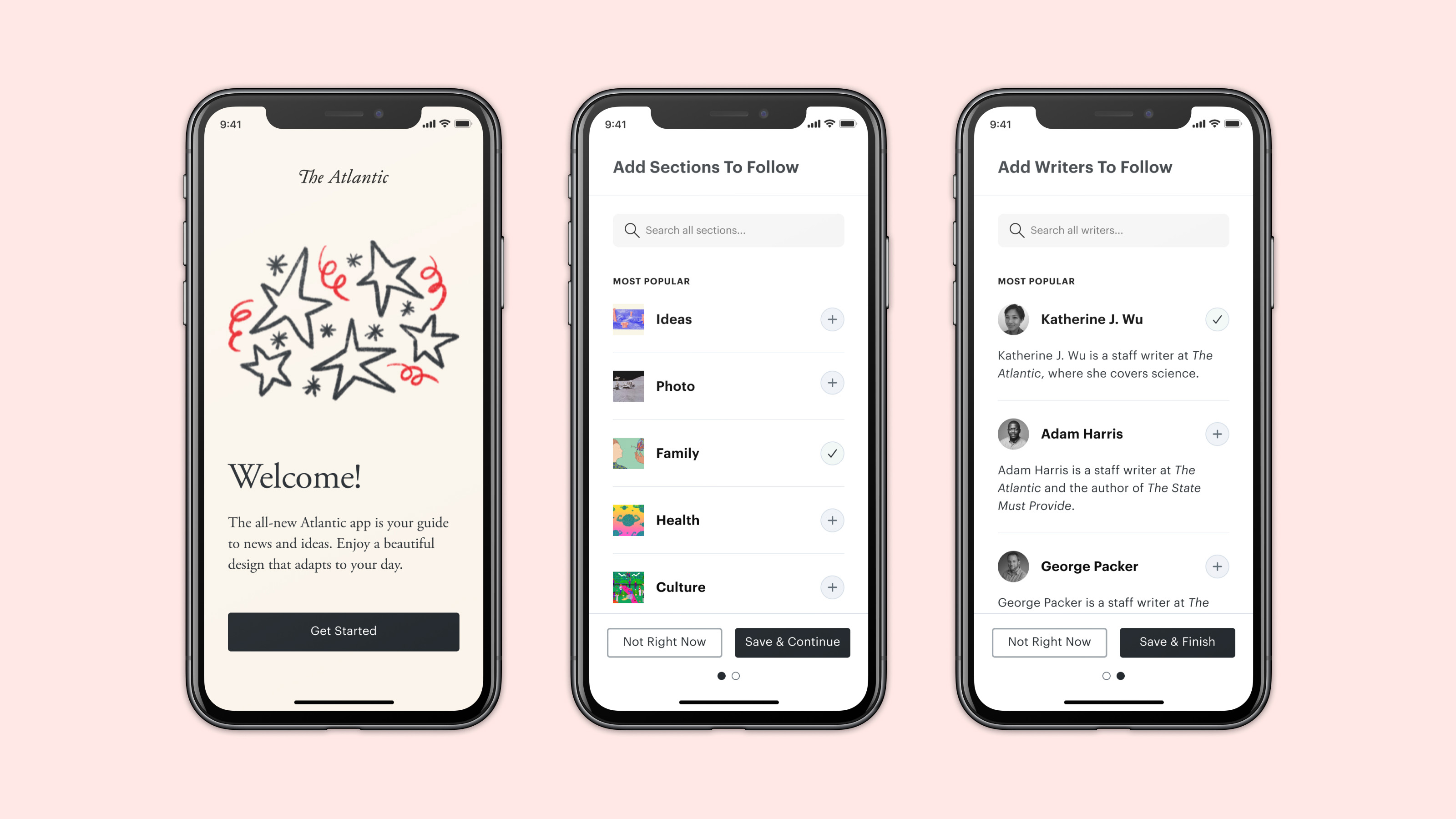
Onboarding with following.
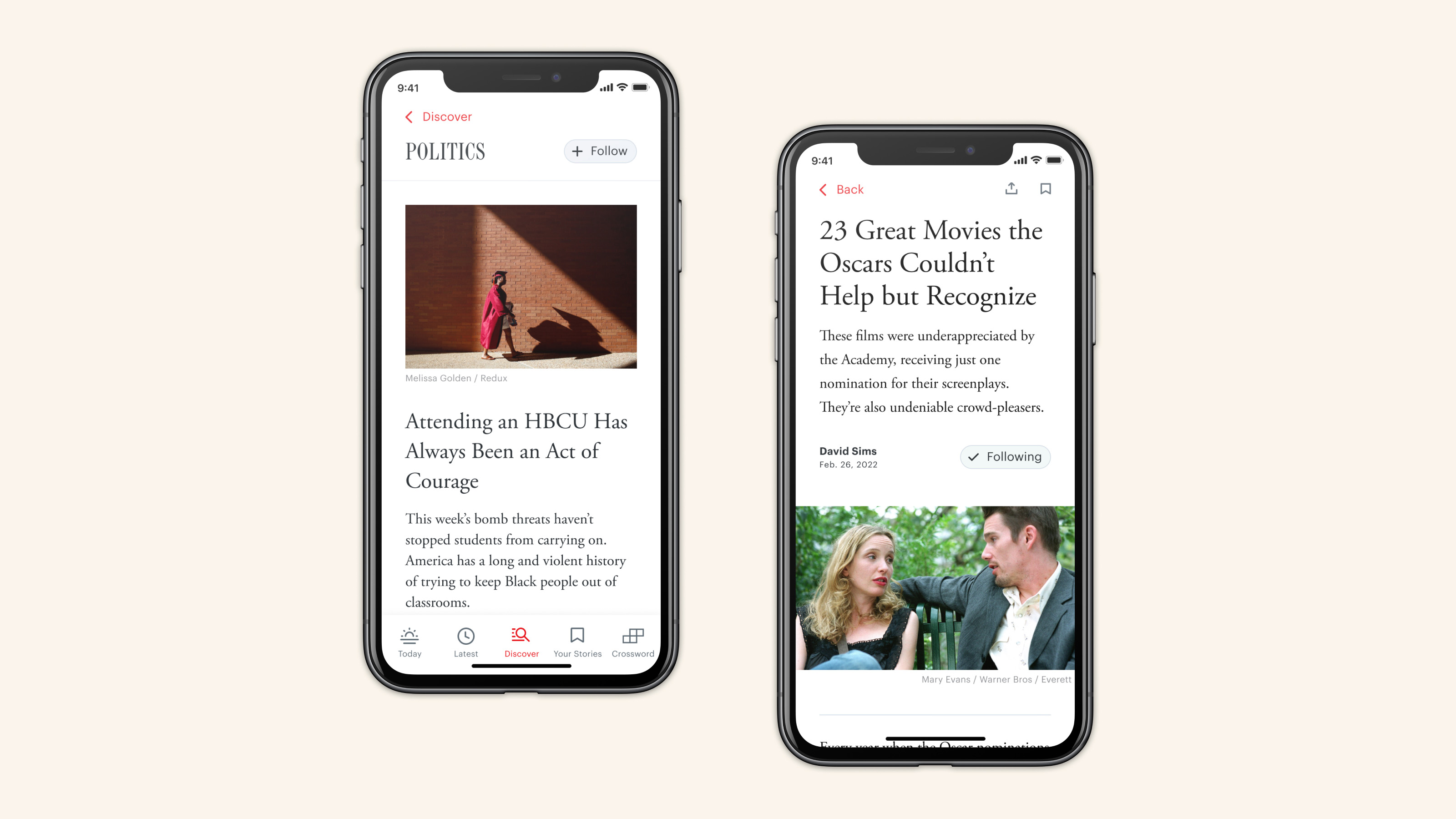
Following throughout the reading experience.
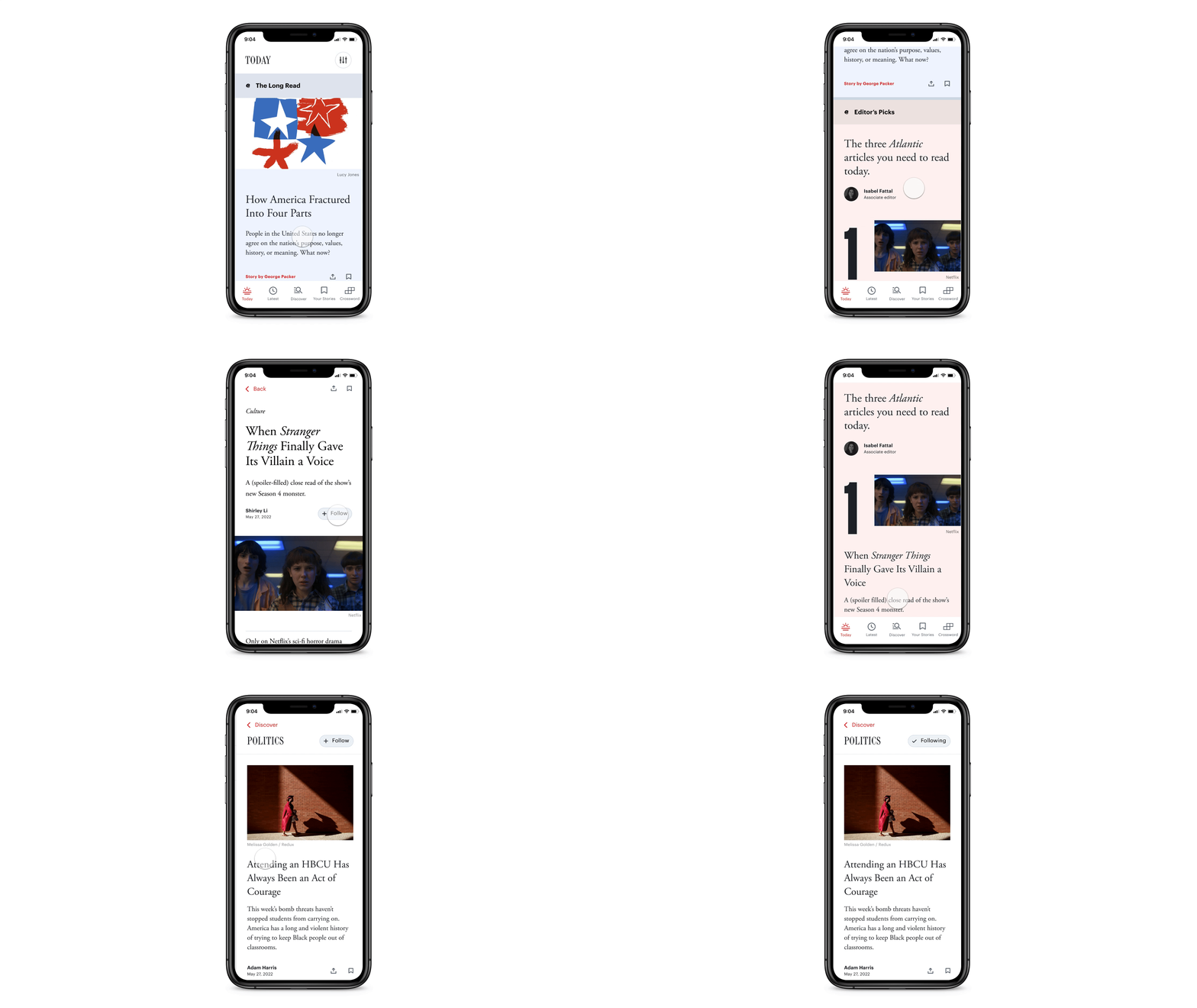
Following interactions.
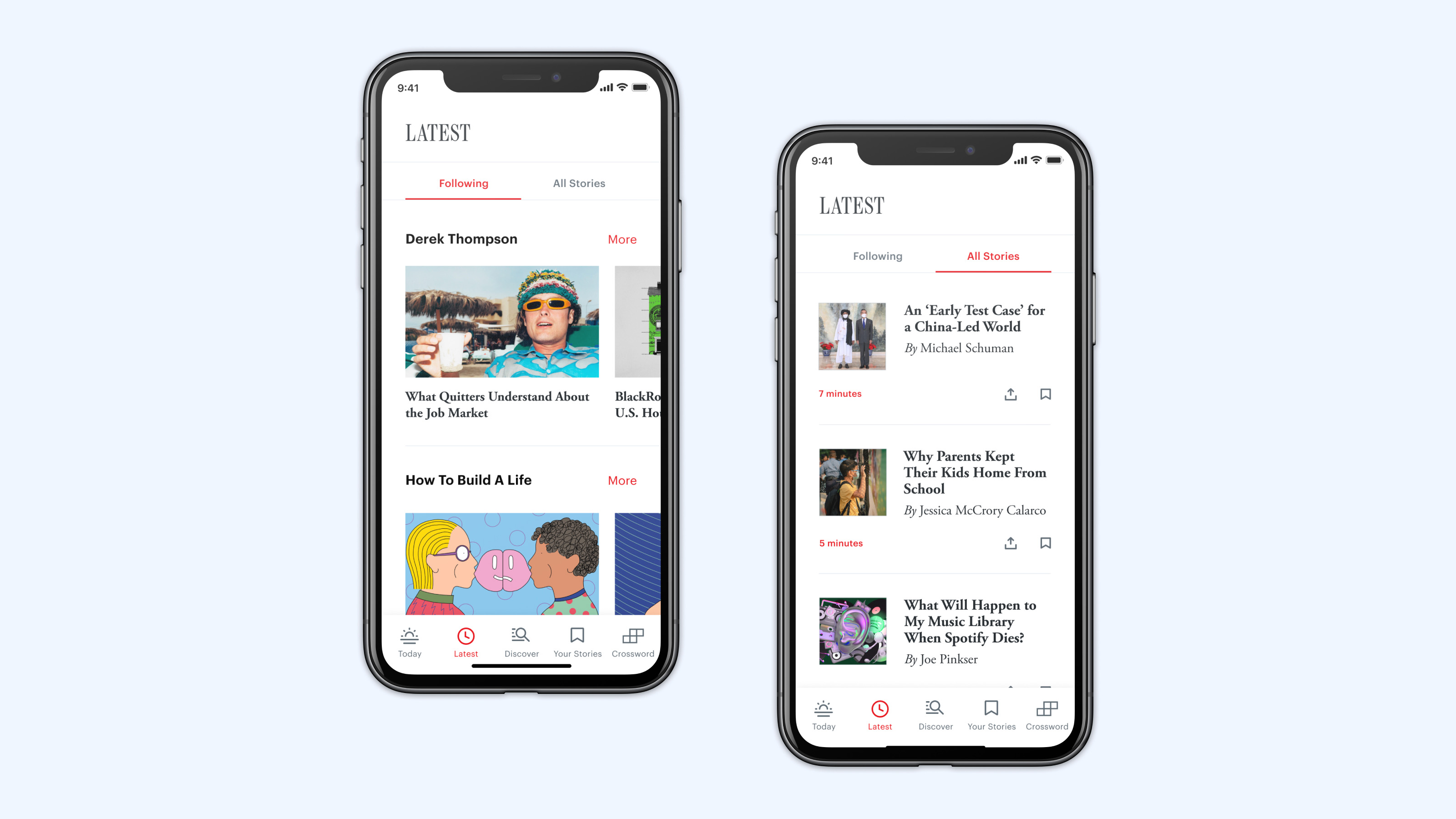
The Latest tab with following.
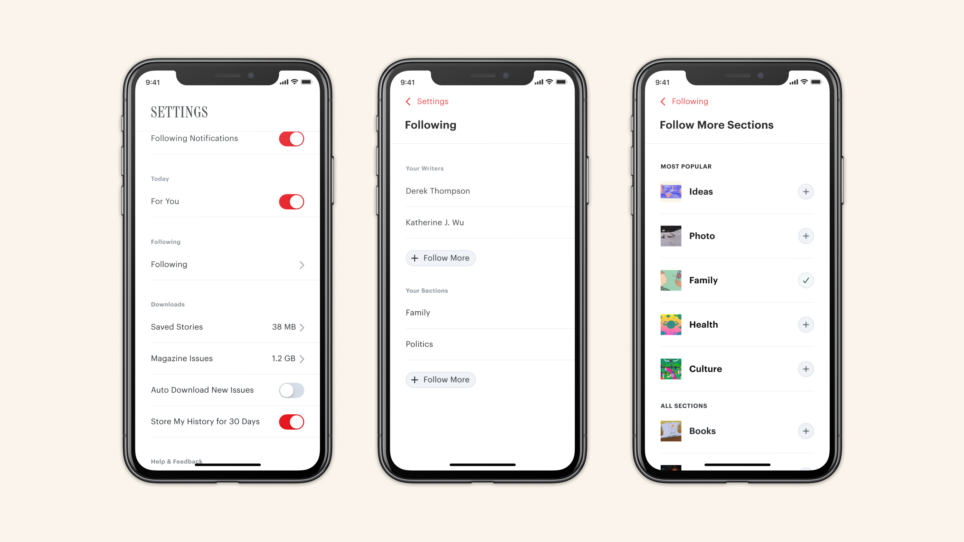
Settings with following.
Pick Up Where You Left Off
We often hear that many readers already feel overwhelmed by news generally, which can keep them from engaging with The Atlantic’s ambitious, long-form journalism. So we recognized the opportunity to help readers make progress on and finish stories through customization and personalization. That includes a cross-platform experience to save articles to your account for later, even marking your exact place in an article if desired. While you might not get through a 20,000-word cover story in one sitting, we can make the best experience out of reading the first few pages and coming back to it later. We pictured a reader starting that story on her computer during her lunch break, picking it back up in the app on her phone on her commute home, and even finishing it as an audio story in our (still hypothetical) TV app at home that evening.
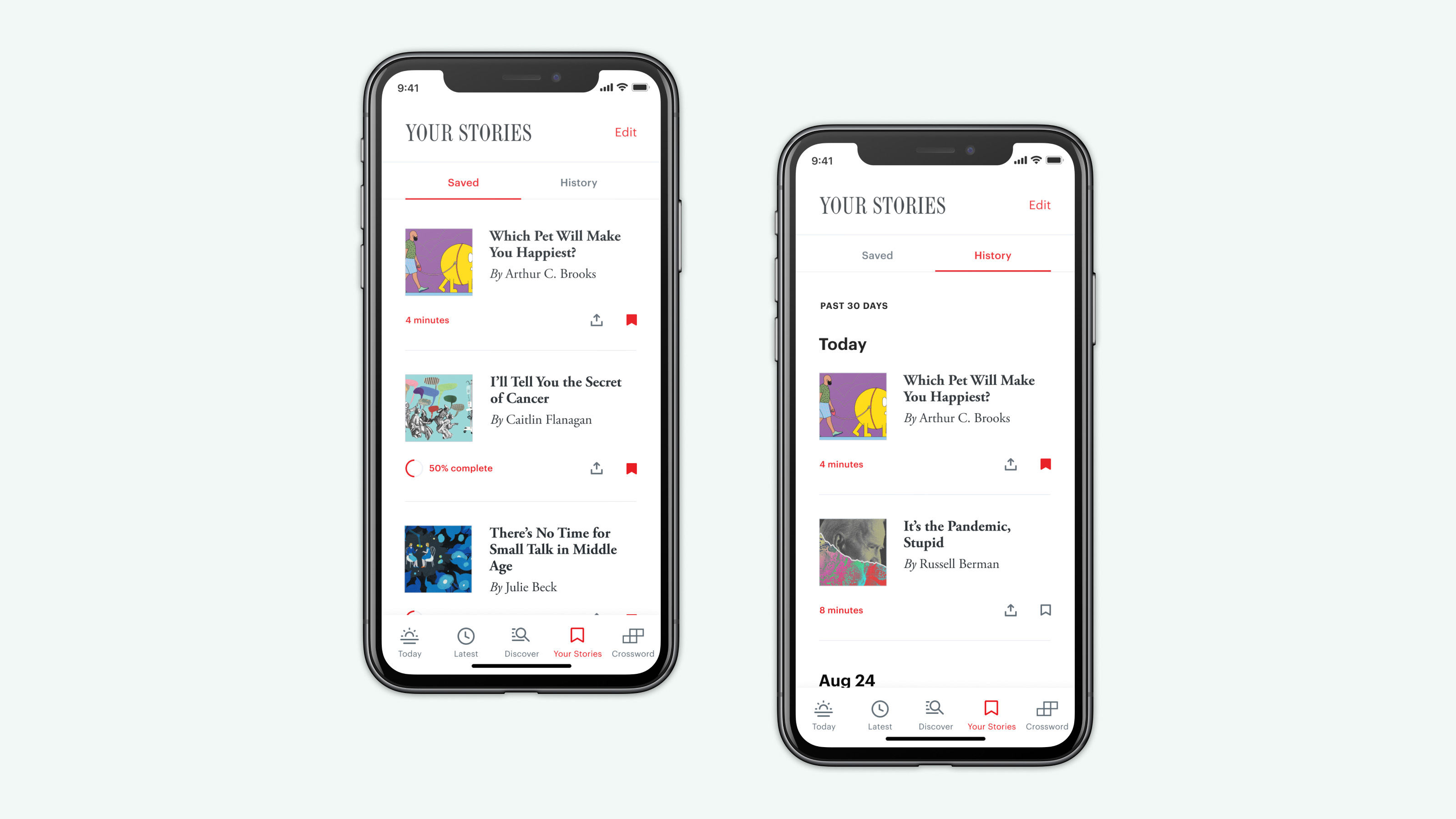
The Your Stories tab.
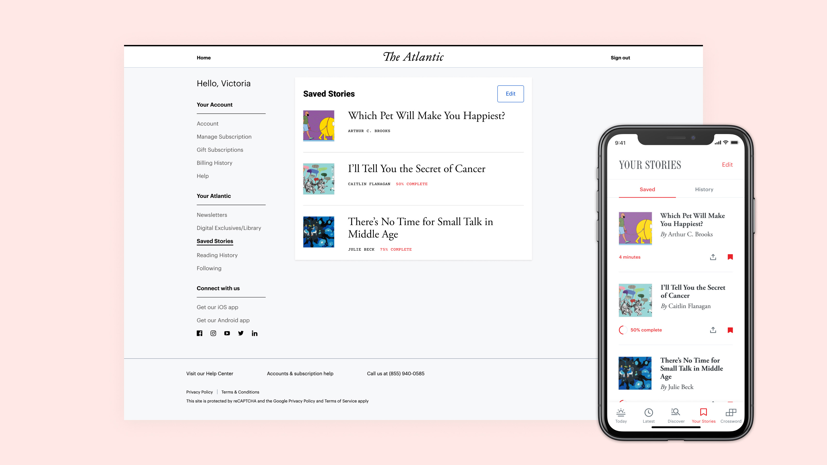
Save a story to your account, and pick it back up on any platform.
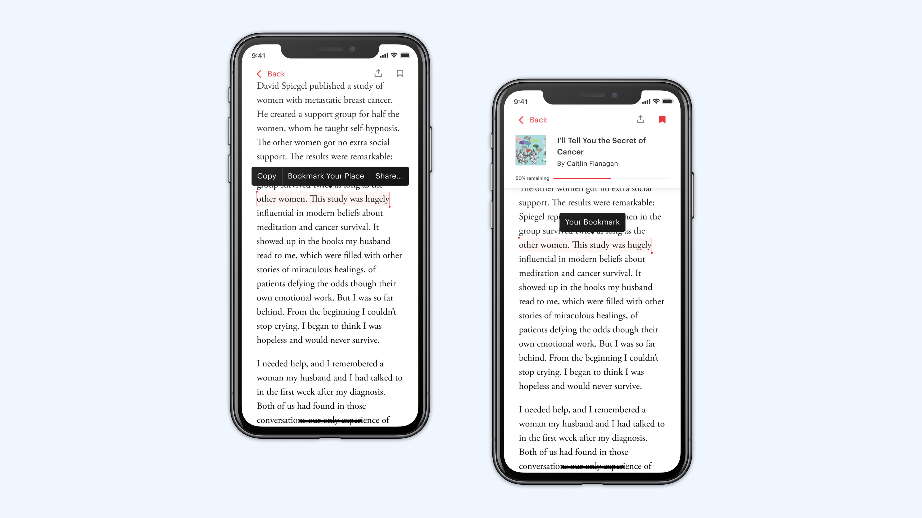
Bookmarking your place in a story.
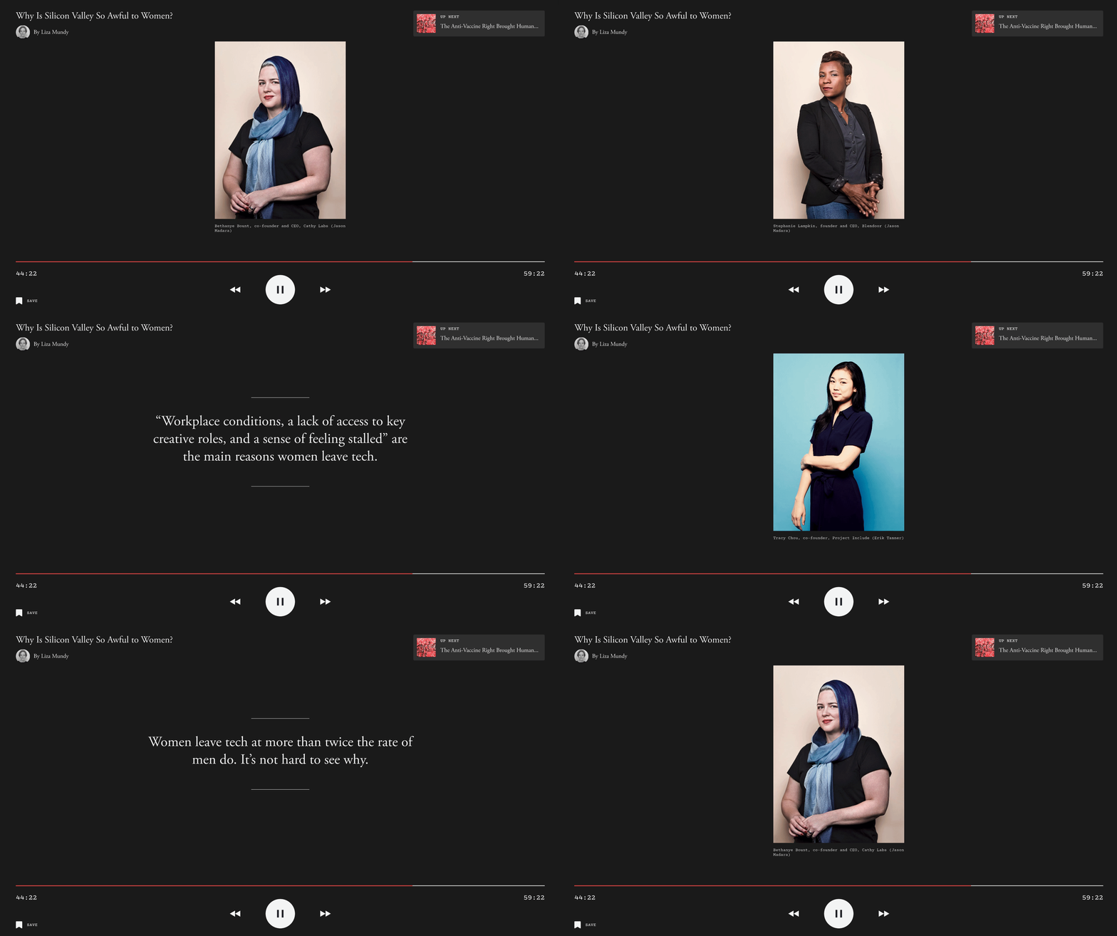
A concept exploration for re-entering a story in a TV app.
What's Next
These ideas represent the potential of customizing and personalizing The Atlantic experience. We’re continuing to explore ways to build on reader habits, making our products more relevant with use and over time. At a time when the news can feel too personal to your pre-existing beliefs and interests, we’re looking at ways to use customization and personalization to expand, not limit, your experience of our journalism and view of the world.