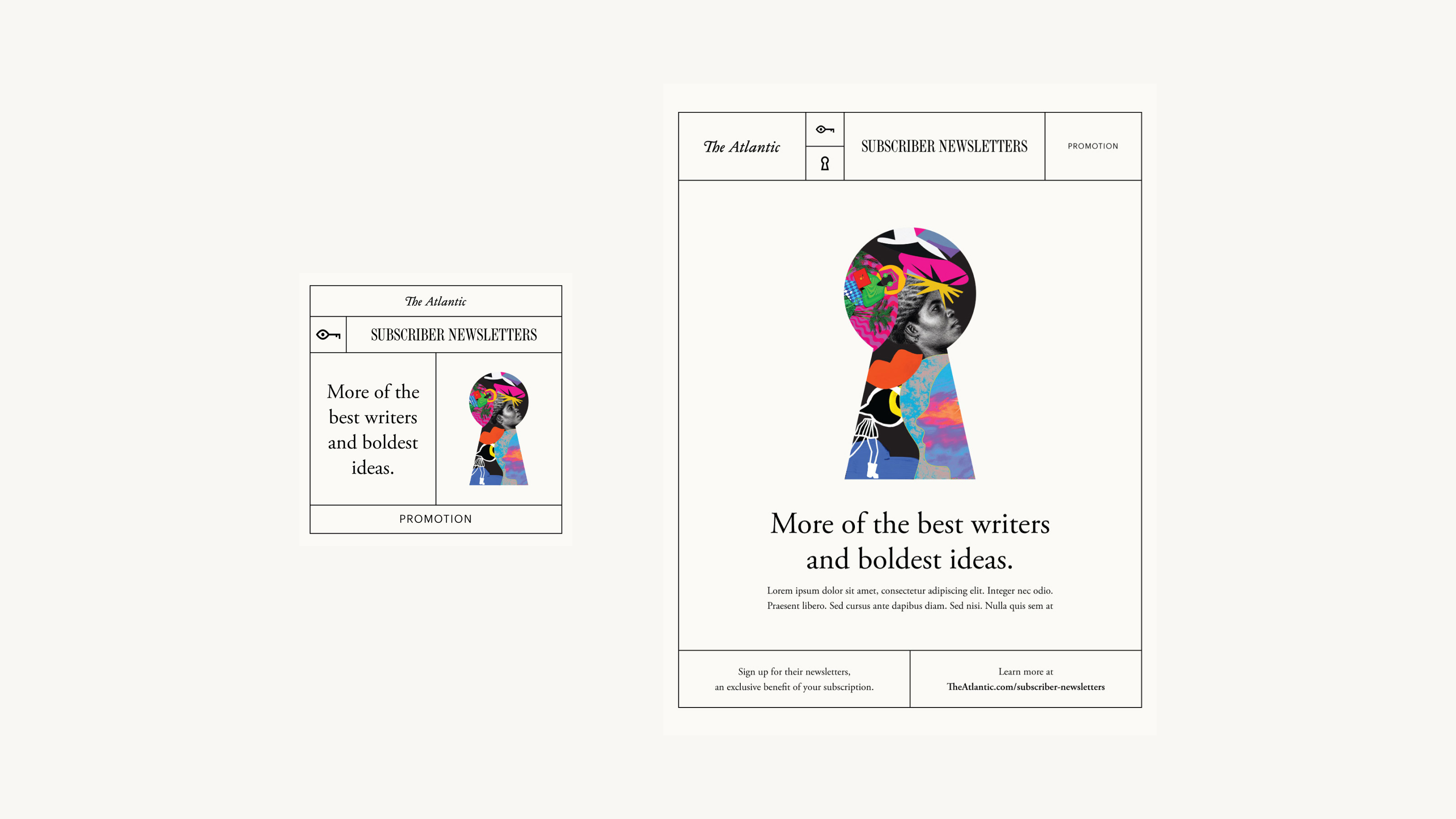
Subscriber Newsletters
The Atlantic introduced a suite of subscriber-only newsletters to attract new subscribers, retain journalists, and improve the value of an Atlantic subscription.
YEAR: 2021
MY ROLE: Senior product designer
CREDITS: Jim Quindlen (executive director of product design), Thanh Do (product designer), Jody Mak (senior product manager)
LIVE: theatlantic.com

Illustrations by The Atlantic.
The Problem
With the rise of Substack and other newsletter platforms, many journalists are leaving established publishers to write independently. At the same time, many publishers are shifting content (including newsletters) behind paywalls in order to support subscription-based business models. The Atlantic decided to launch a suite of newsletters just for paying subscribers, bringing new writers to The Atlantic while still allowing them independence.
Branding
We conceptualized subscriber newsletters as part of The Atlantic brand, but bolder and less refined, since the offering is semi-independent from The Atlantic’s editorial team. I incorporated our existing typography system (a major part of The Atlantic brand), while differentiating subscriber newsletters with a unique header system and background color. The modular header system allows writers a space to customize their individual publications within the suite – which is especially important to the several writers who moved an existing newsletter under The Atlantic’s brand.
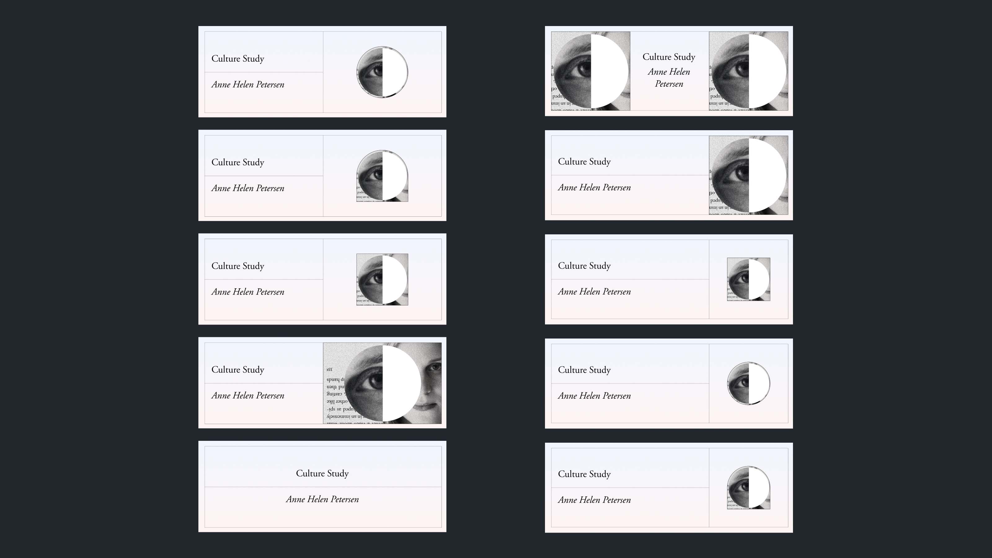
Exploring a modular header system.
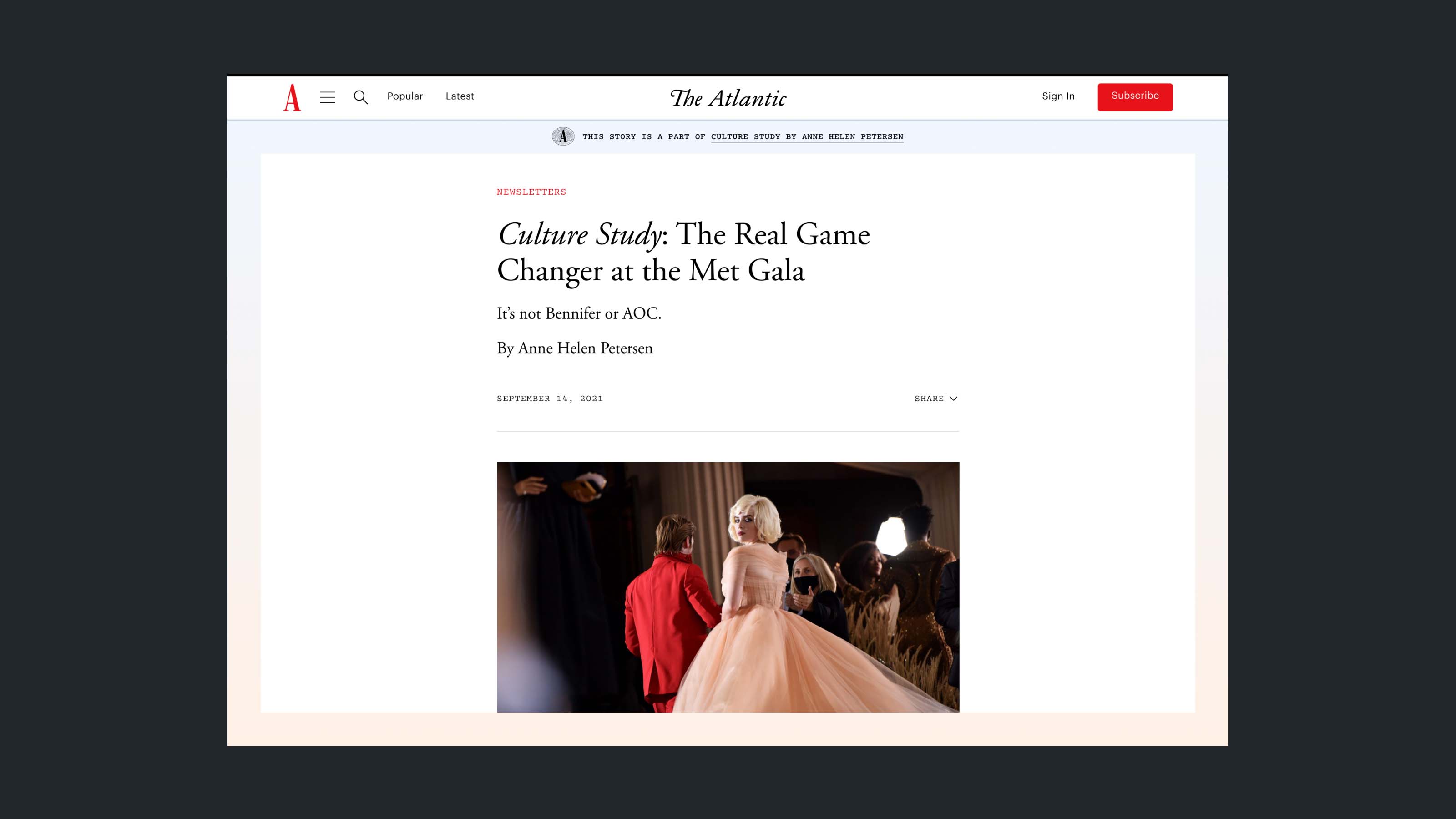
Exploring a gradient frame.
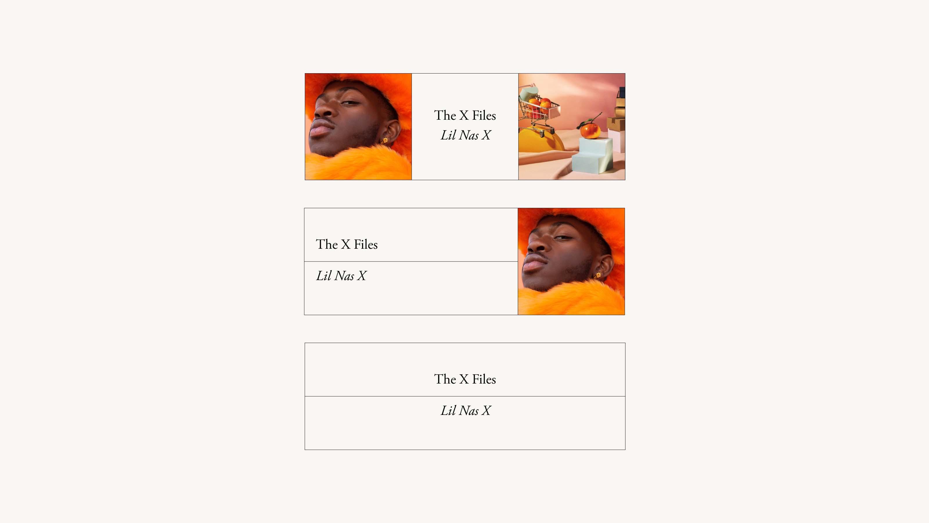
The final header system has three options for writers to accommodate: two images, one image, or no images.
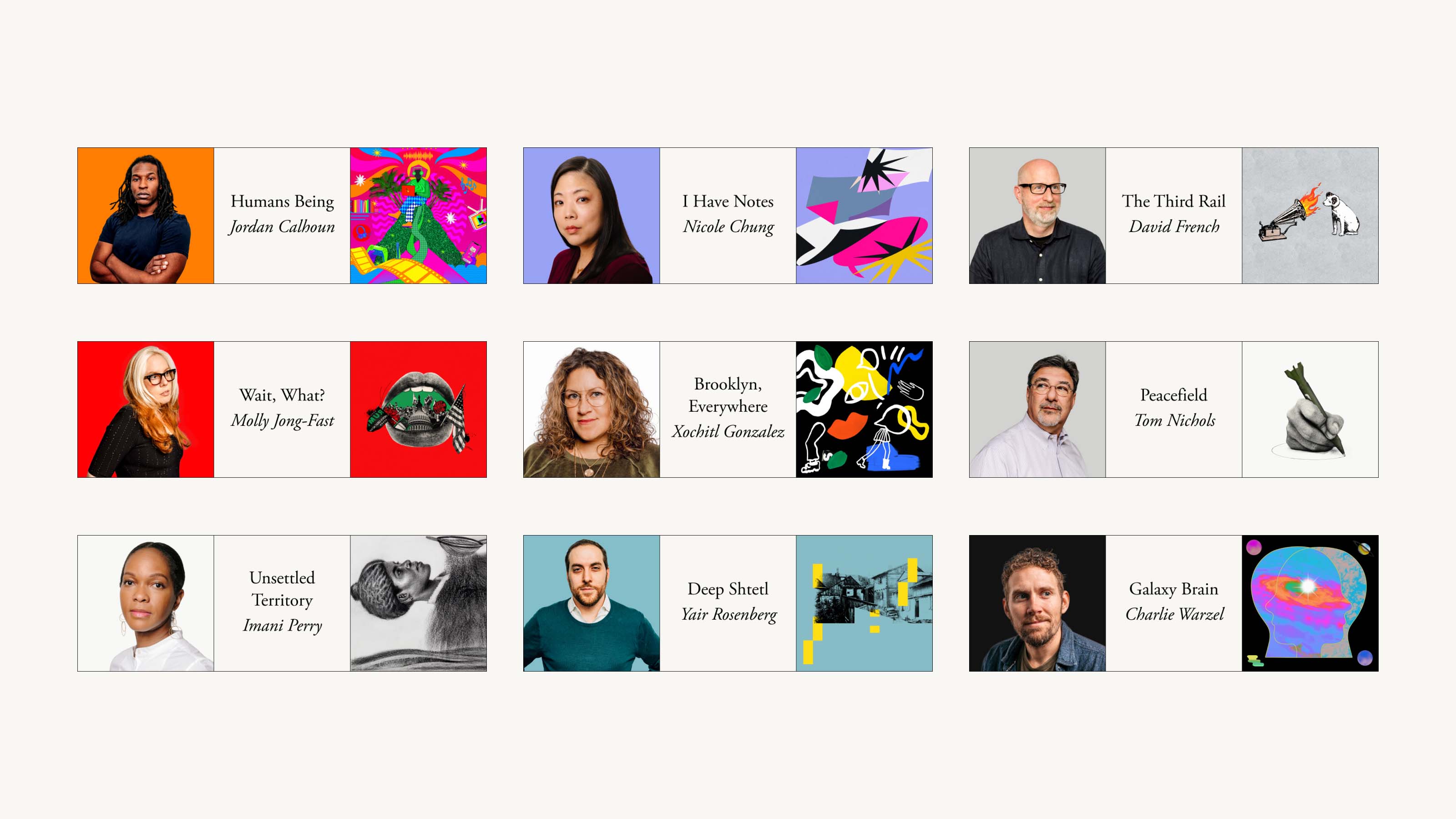
Final header designs for subscriber newsletters.
A Complicated Message
Our priority for this project was to grow our newsletter email lists, assuming that non-subscribing newsletter readers will convert to paying Atlantic subscribers in the future. For this reason, leadership decided to launch with a “free period” of full access to subscriber newsletters for everyone (not just subscribers). And after the free period, anyone can still sign up for occasional “free editions” of subscriber newsletters (again, not just subscribers). Lastly, adding to this complexity, The Atlantic continues to offer a separate suite of “always free” newsletters.
Obviously, this is a complicated model to convey to readers – especially readers new to The Atlantic. I focused on simplifying the newsletter sign up flow, balancing usability with our marketing team’s desire to “upsell” Atlantic subscriptions throughout. I also advocated for user testing before launch, which helped us to refine our messaging – a major factor in the user experience of this product.
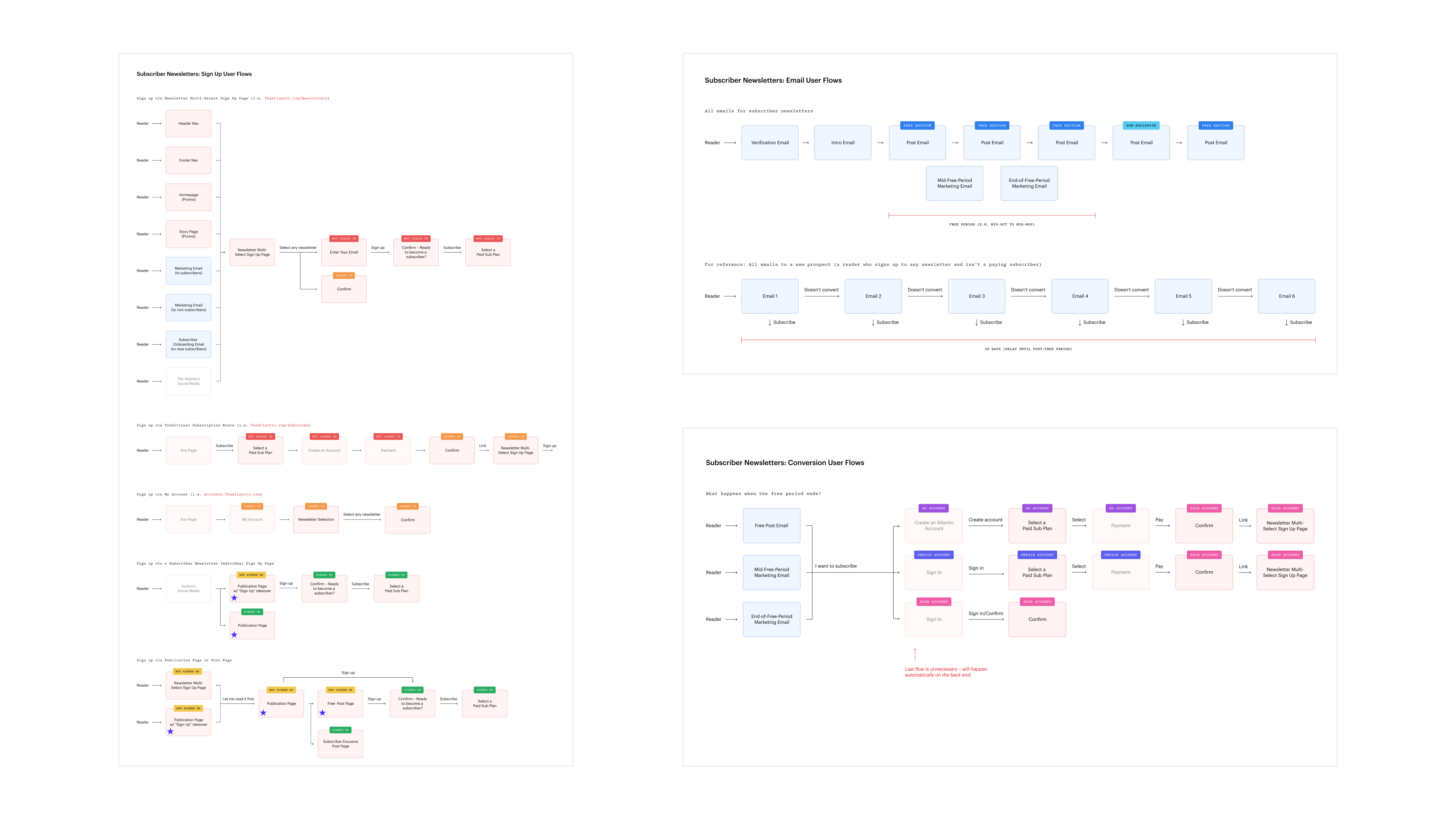
User flows.
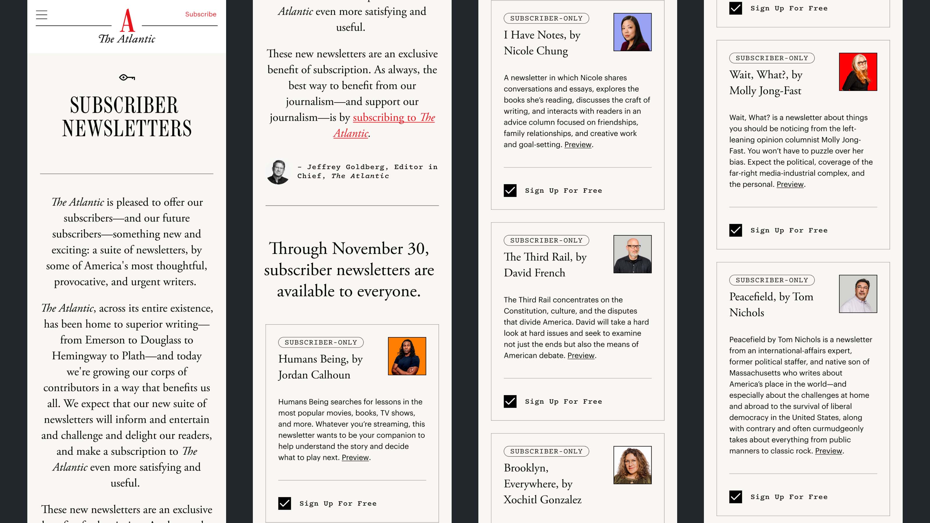
Sign up page for all subscriber newsletters.
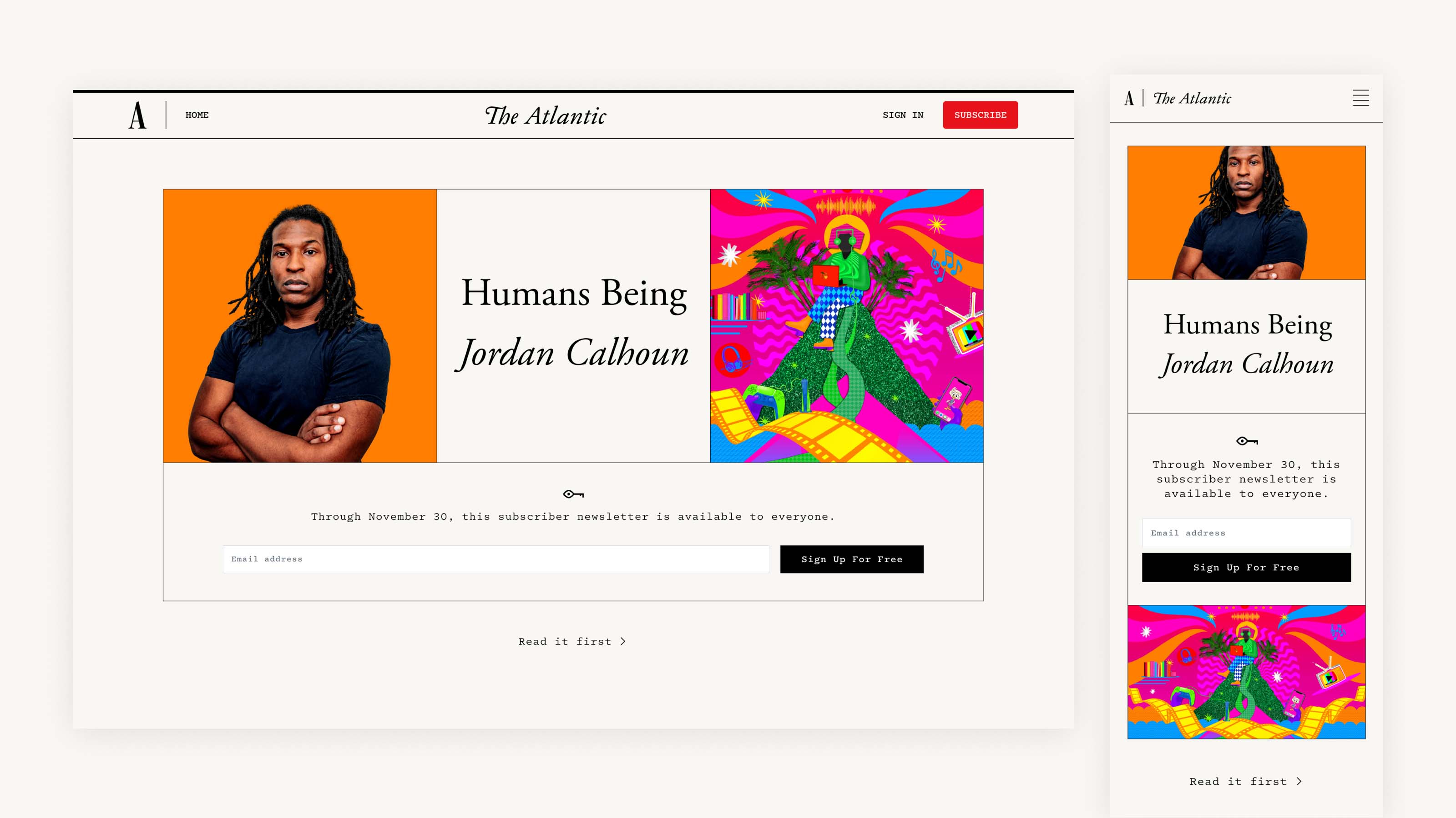
Sign up page for an individual subscriber newsletter.
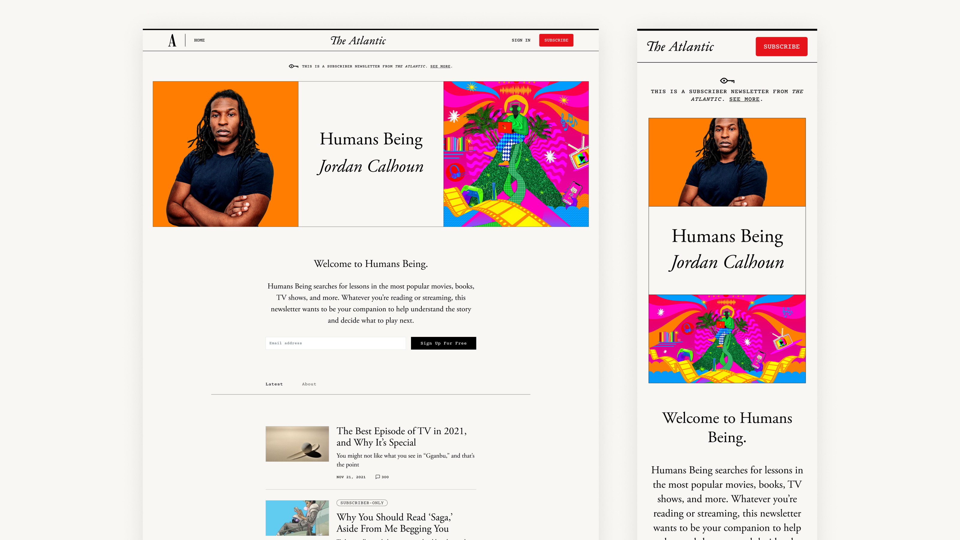
Publication page.
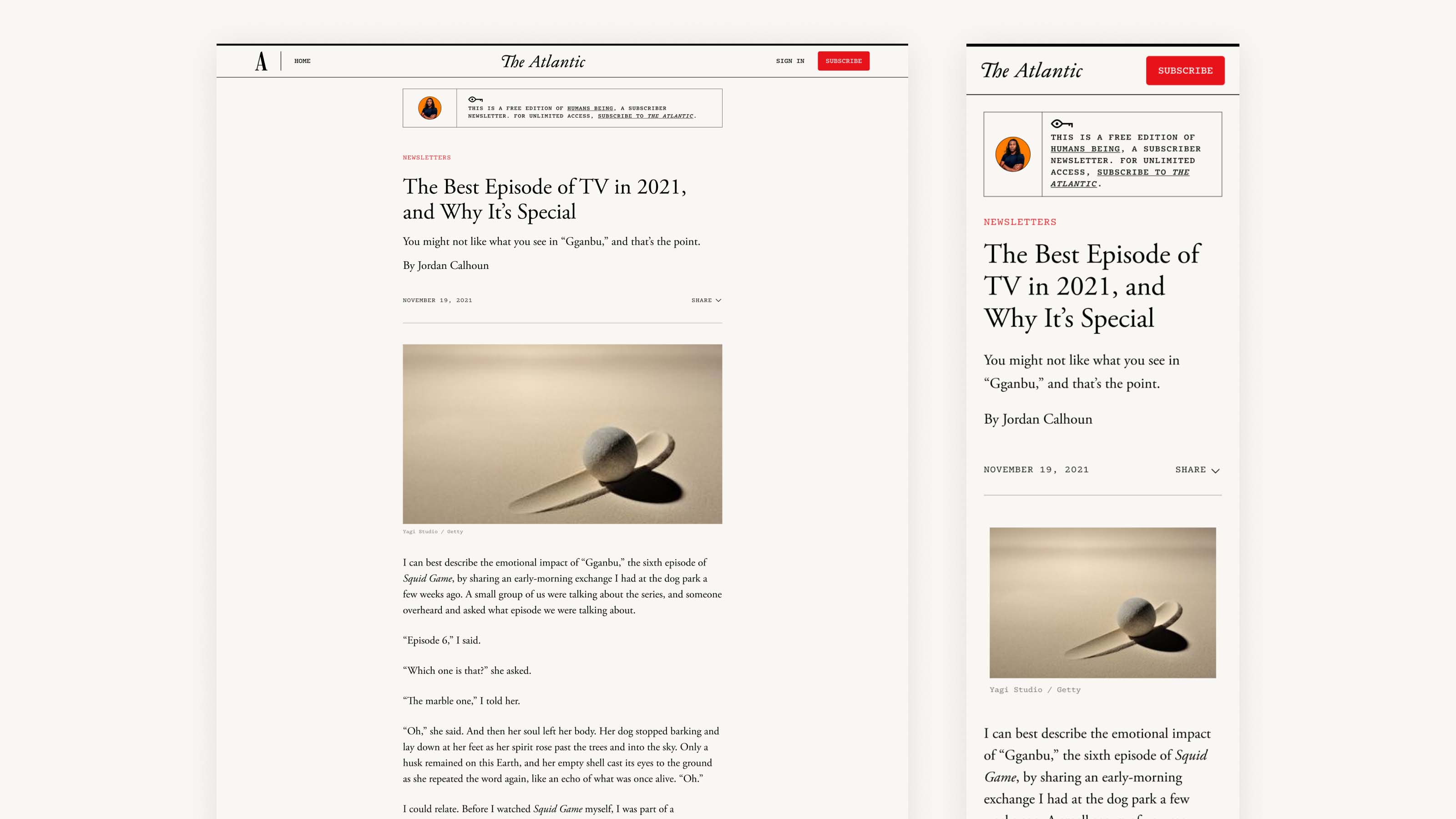
Post page.
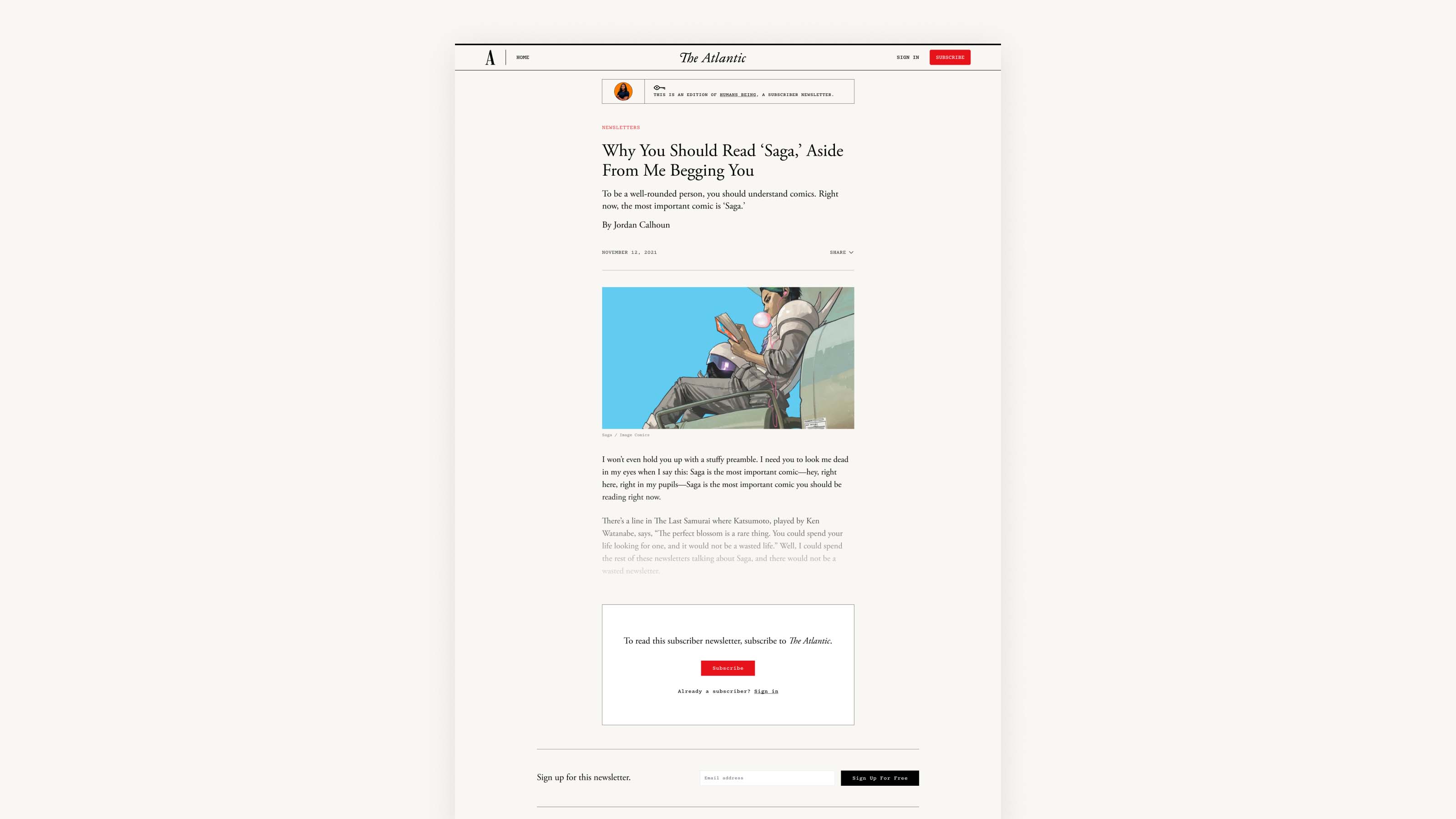
Post page with gate.
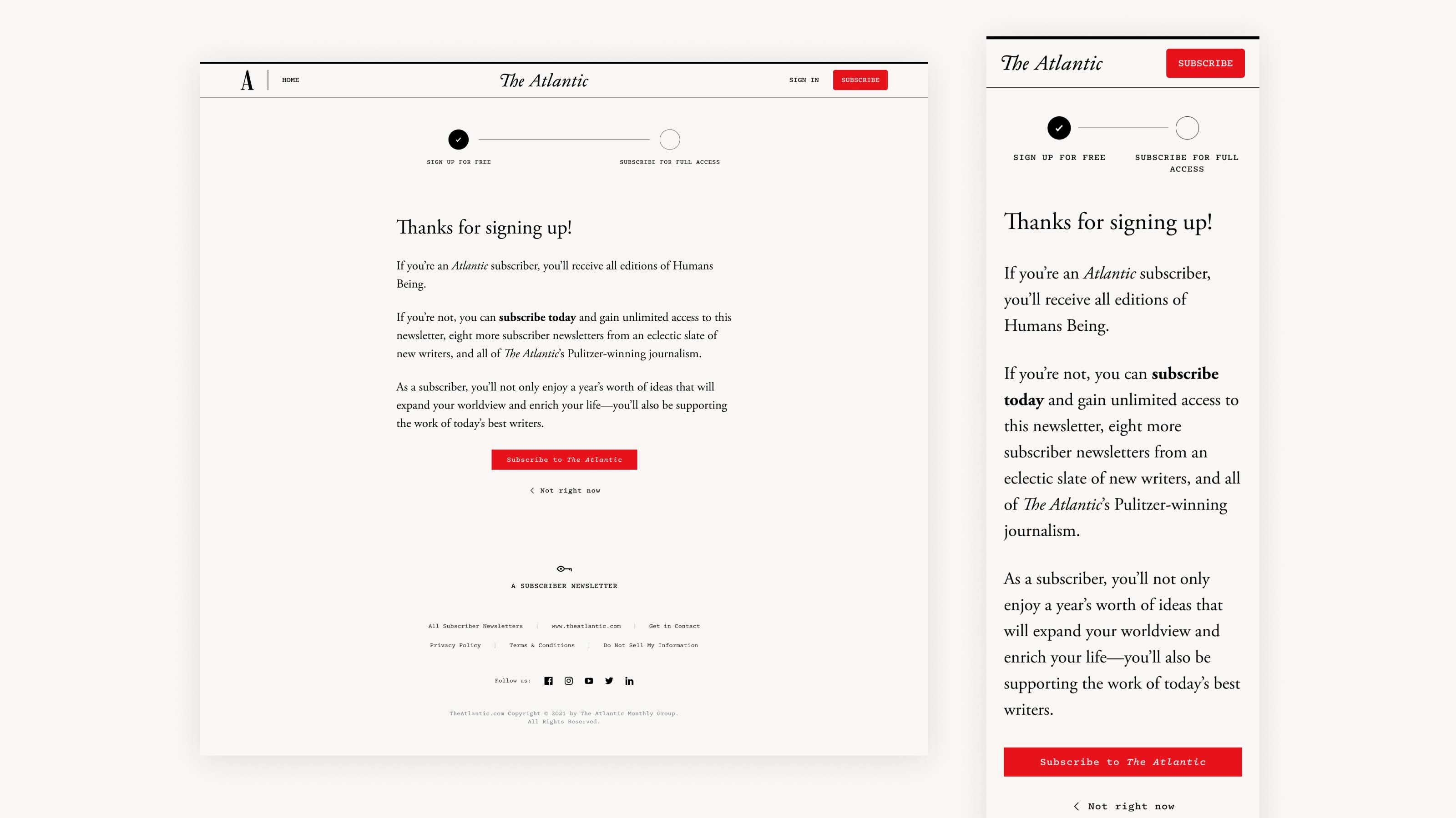
Confirmation page.
Newsletter Design System
In a previous project, I mentored a mid-level designer on the team in creating a design system for all of The Atlantic’s newsletters in order to bring all of our newsletters in line with The Atlantic’s recent rebrand. When we decided to expand to paid newsletters for this project, our design system facilitated this expansion – standardizing subscriber newsletters with our existing free newsletters, while also allowing us to incorporate intentional differences like the unique background color and newsletter header.
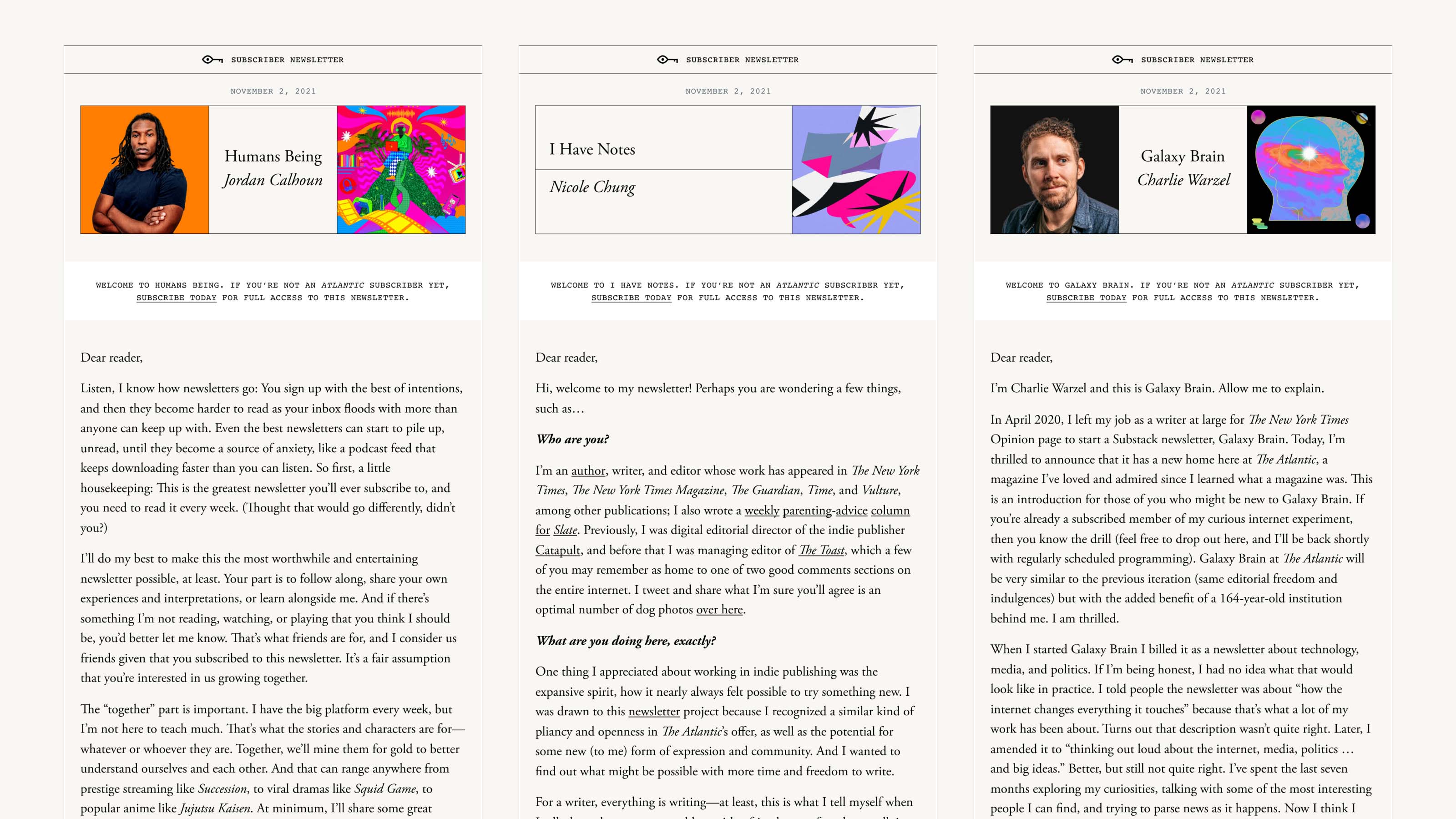
Subscriber newsletters emails.
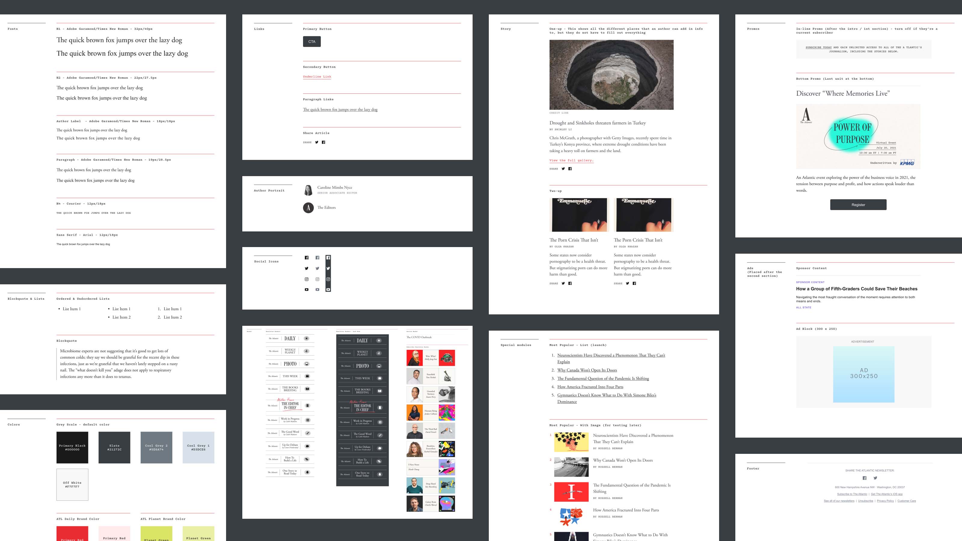
Newsletters design system: The design system reduced the engineering time to launch a new staff newsletter to one week. (Credit: In collaboration with Thanh Do.)
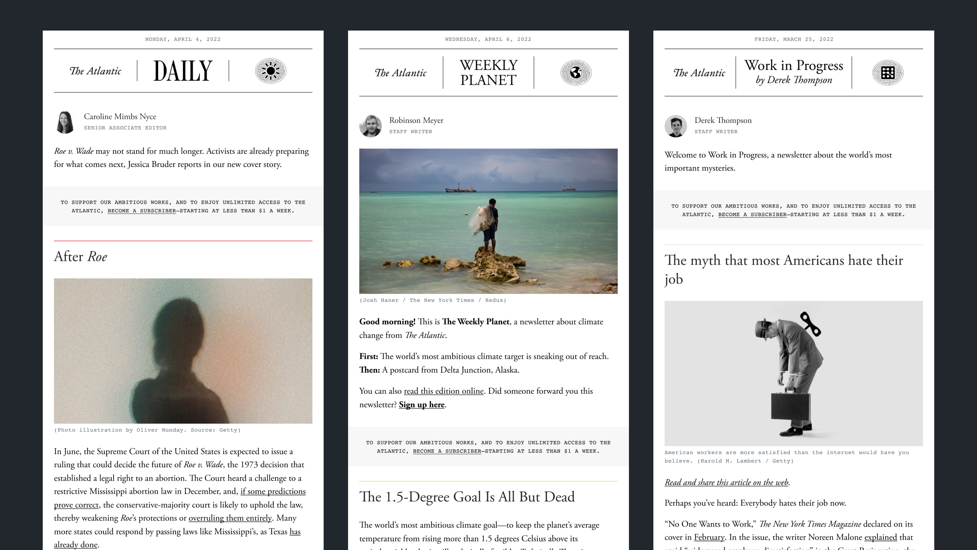
Staff newsletters using our newsletter design system. (Credit: In collaboration with Thanh Do.)
Launch
We successfully launched The Atlantic’s suite of subscriber newsletters in eight weeks. Of our subscriber newsletter recipients, more than half are new Atlantic readers – who we now have the opportunity to convert into paying Atlantic subscribers.
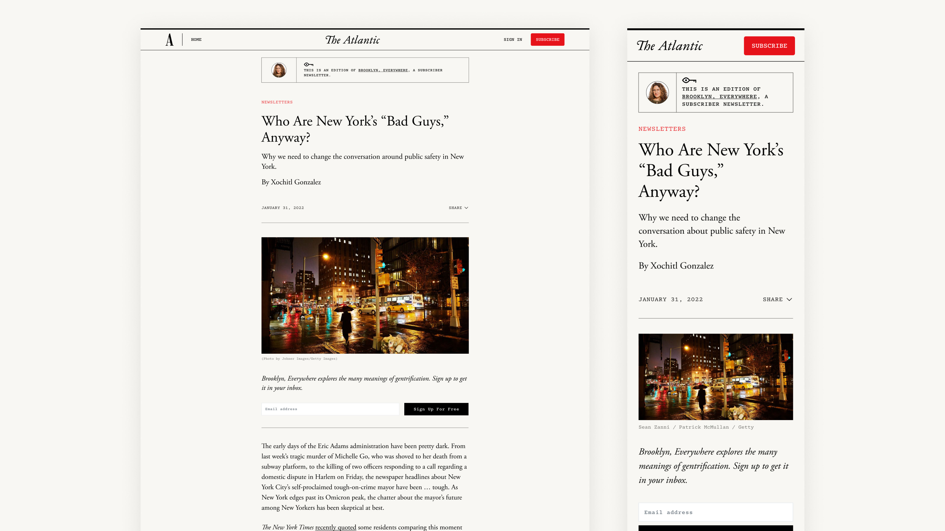
Post-launch: We added a more prominent newsletter sign up CTA on post pages.
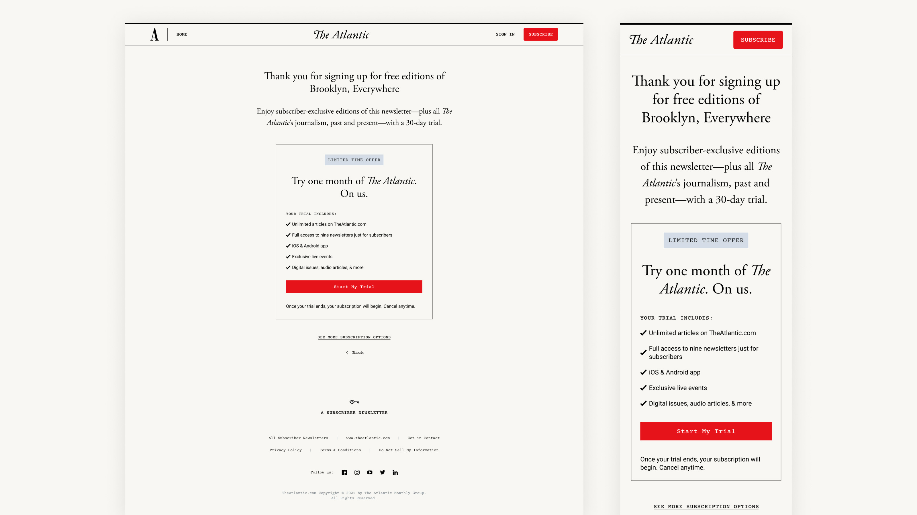
Post-launch: We focused on upselling a trial subscription when a reader signs up for a subscriber newsletter.
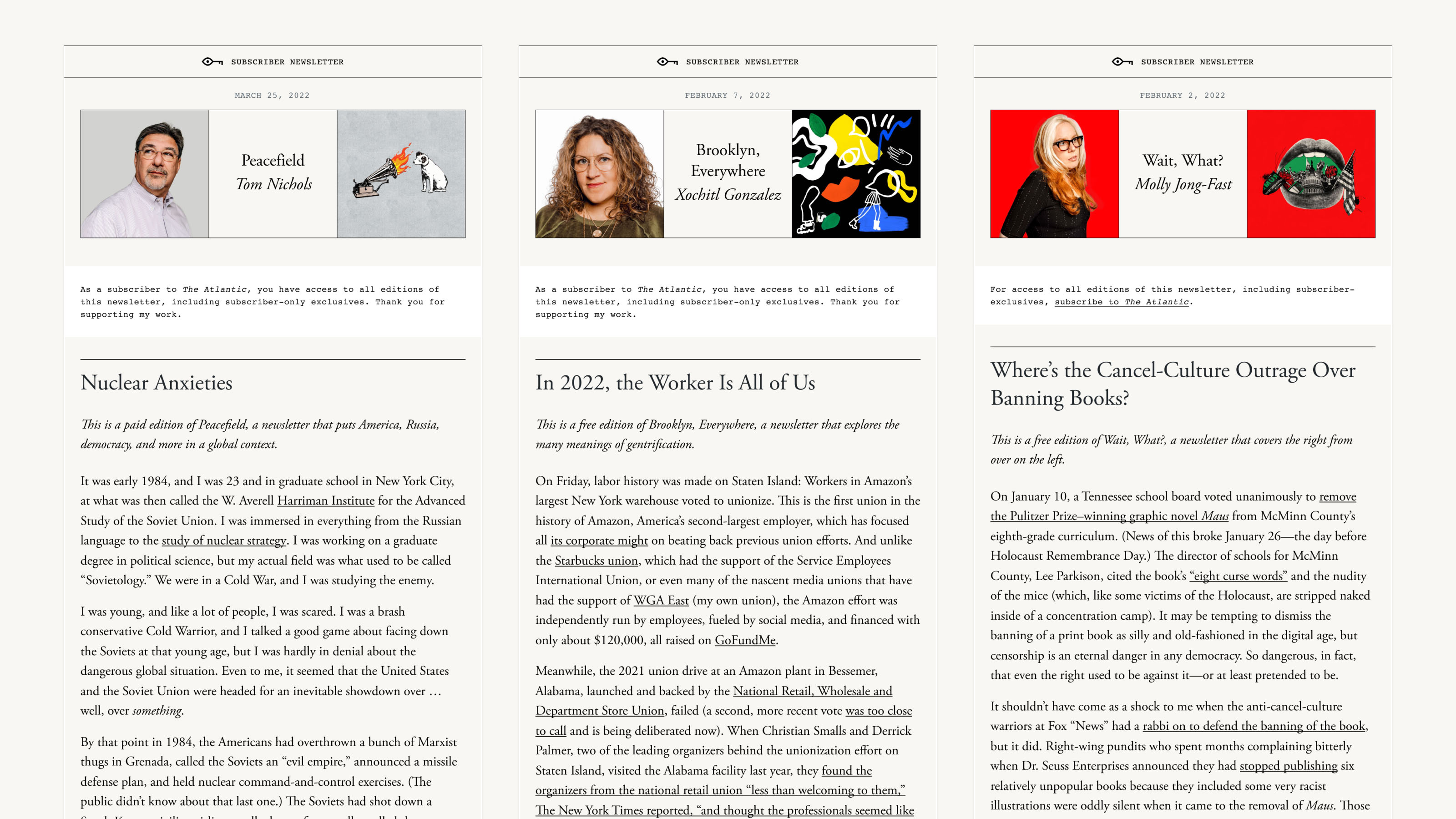
Post-launch: We differentiated messaging to subscribers vs. non-subscribers.
