Falcon CMS
As First Look Media’s first dedicated UX designer, I improved the company’s content management system, used by editors and writers across its four brands.
YEAR: 2018-2019
MY ROLE: UX product designer
CREDITS: Allegra Denton (VP of product & user experience), Fei Liu (product designer)
LIVE: firstlook.media
The Problem
Falcon is First Look Media’s internal content management system, used by editors and writers across the company’s four brands (Topic, The Intercept, Field of Vision, and the Nib). Developers at First Look first built Falcon quickly, operating in startup mode without much attention to UX. Designers had rarely worked on the CMS before I was hired, so the platform was functional but not very user-friendly. Falcon organized content in a way that made sense to developers, but not to editors and writers. This user experience often frustrated editors, who felt like they lacked transparency into our team’s progress on improvements and new feature requests.
My manager had already worked to identify top priorities for what we began calling the “Falcon Improvement Project” – an effort to improve the CMS as well as product and tech’s working relationship with editorial. Managing lists emerged as a top priority for design thinking because it both influences the common workflow of curating any homepage in Falcon and typified the developer-first mindset that frustrated editors.
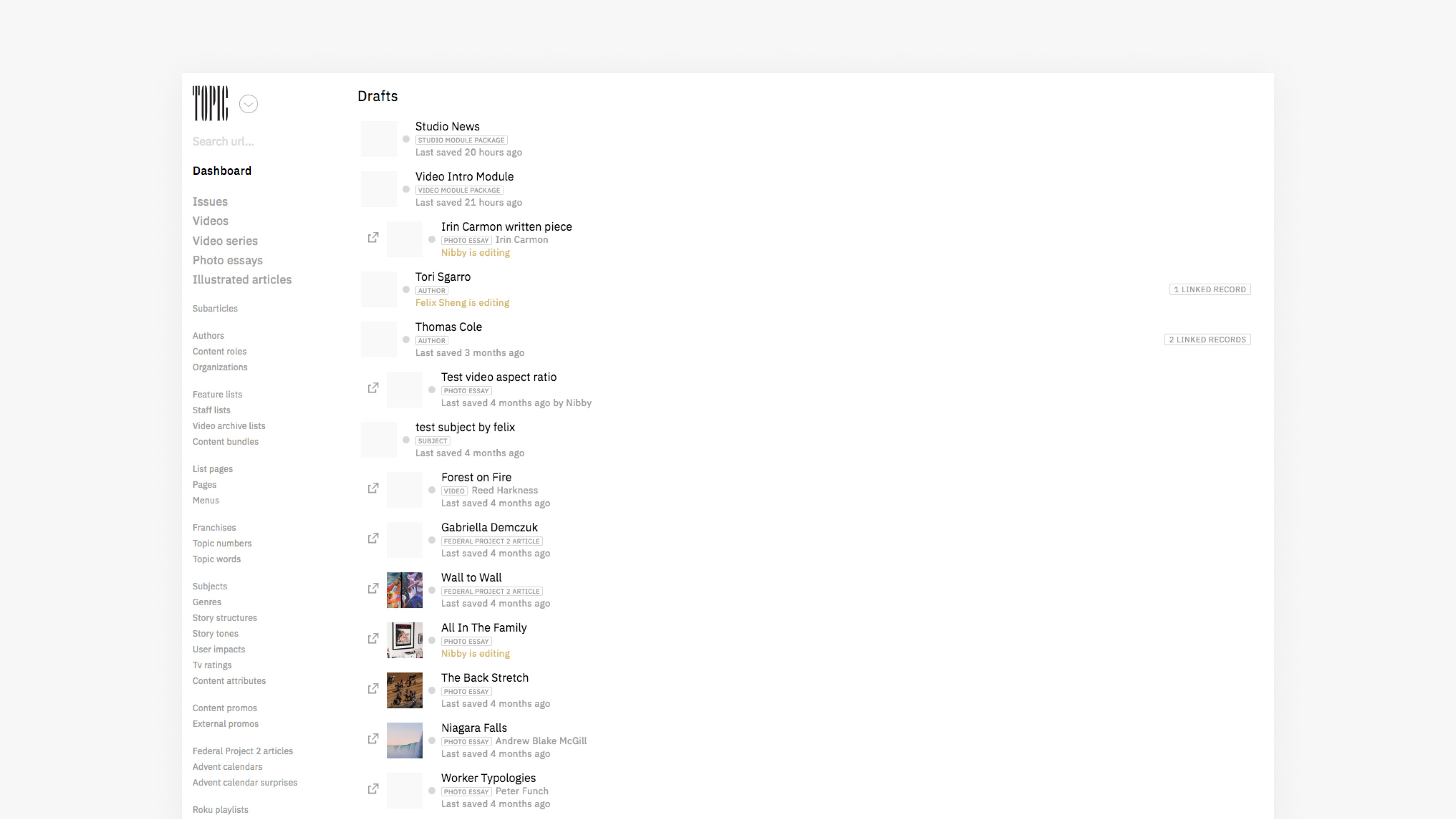
The original Falcon UI – my starting point.
What Is a Homepage, Really?
Fundamentaly, a homepage is a list of content and/or groups of content. While groups of content like a video series or a collection of stories remain related elsewhere on a site, editors also create new groups of content only relevant to the homepage (for example, a grid of four recent – but unrelated – featured stories).
To create these new content groups specific to homepages, editors would use a workaround in Falcon, treating these single-use groups the same as a resuable group. This hack cluttered Falcon’s information architecture, which had to house lists of content that editors never used again. It also required working in multiple tabs and with multiple saves, which didn’t accurately reflect editors’ mental model of this workflow.
The original homepage editor: Editors had to create all items labelled “Feature List” on another page in Falcon, and then add them to this homepage list.
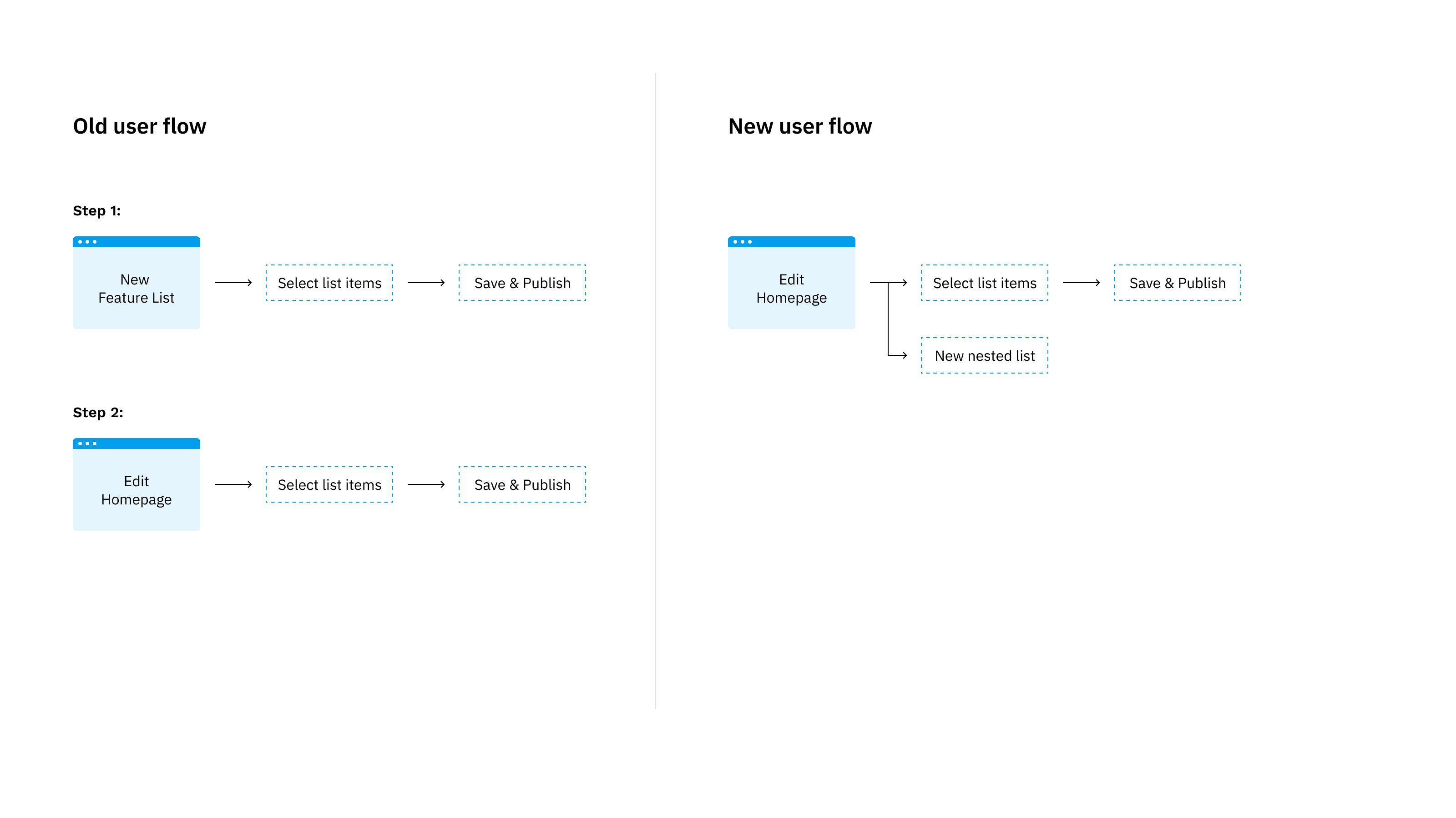
We wanted to change the user flow on the left (with multiple steps for creating a homepage) to the user flow on the right (with just one screen that more accurately reflects editors’ ideal workflow).
Jumping In
While I usually start any new feature project with discovery interviews, I joined First Look at a time when my manager had already defined the problem and was eager for me to jump into designing. So I worked through rounds of feedback with her, a developer, and a product designer for The Intercept (this feature set would be The Intercept editors’ first introduction to Falcon) on initial designs. Then I introduced and led usability testing into the team’s process for the first time, in order to validate our “nested lists” feature.
We felt confident that allowing editors to make new groups of content directly on the homepage editor (what we called “nested lists”) in Falcon would solve the general problem, but we expected some blind spots in the execution to emerge as we tested. We tested the same design with editors of Topic’s homepage and The Intercept’s homepage.
In addition to yielding design insights, testing with editors helped them to feel included in our process. (It especially benefited buy-in from The Intercept editors, who worried about moving their homepage curation workflow from WordPress into Falcon with this project.)
A early homepage editor design that we tested with editors.
Same Parts, Different Wholes
While our tests confirmed that designing “nested list” functionality would solve the general problem, in testing we discovered two main takeaways for improvements:
1) Our initial designs supported Topic editors’ workflow: they needed more design customization (a flexible layout).
2) Our initial designs felt too precarious for The Intercept editors: they needed a preset list of modules to fill with content (a fixed layout).
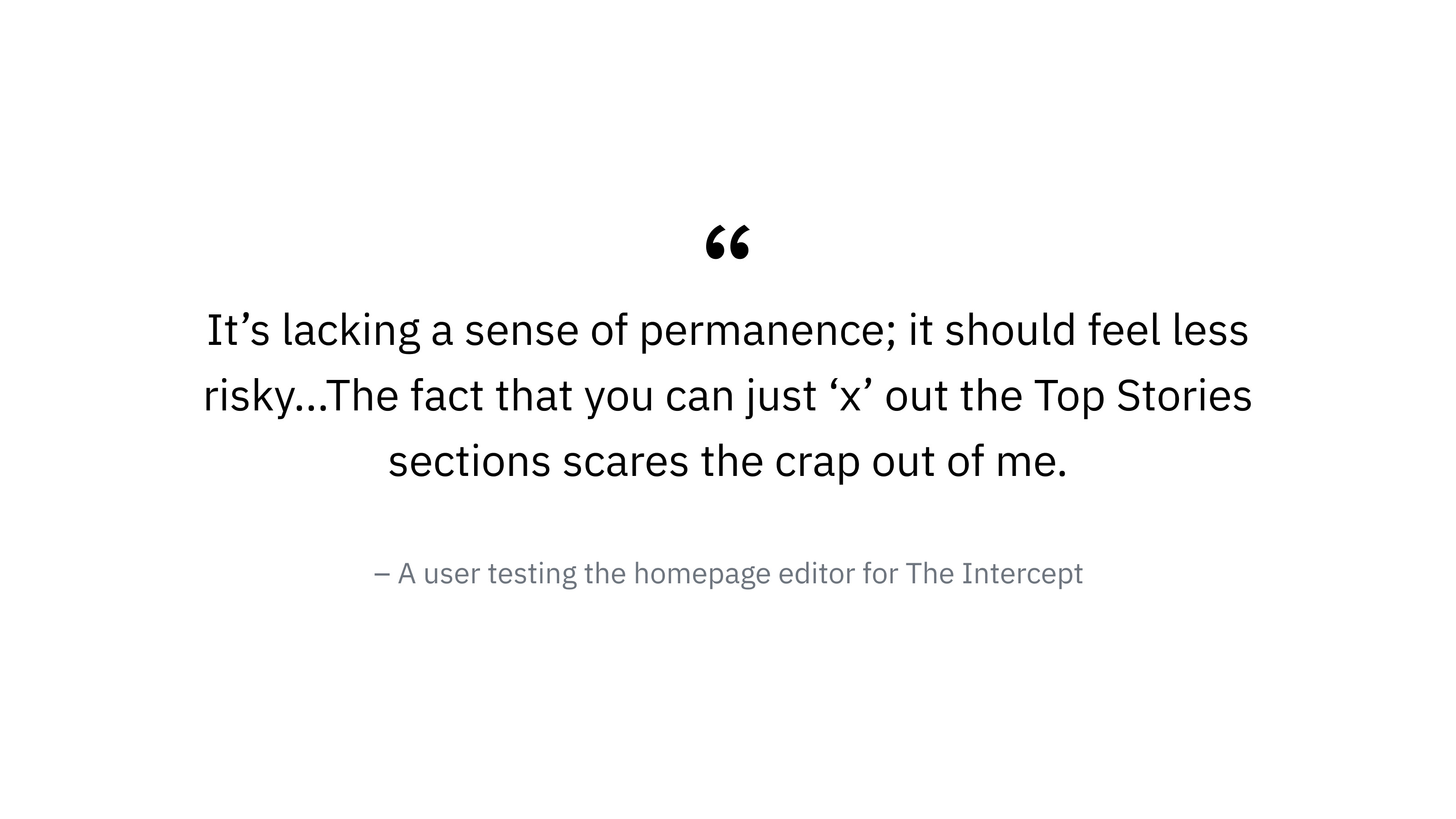
User feedback from our first round of testing.
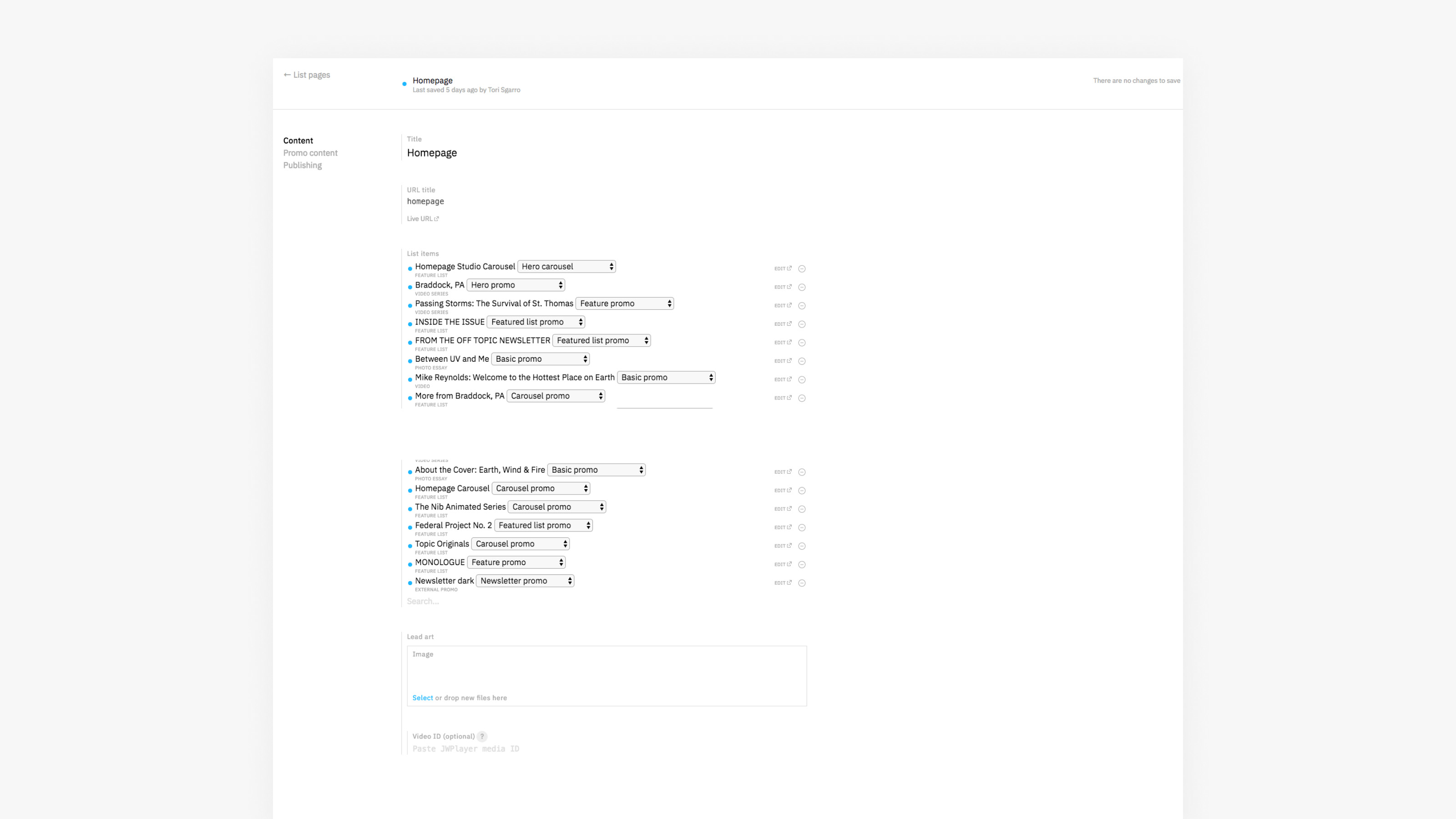
The New Homepage Editor
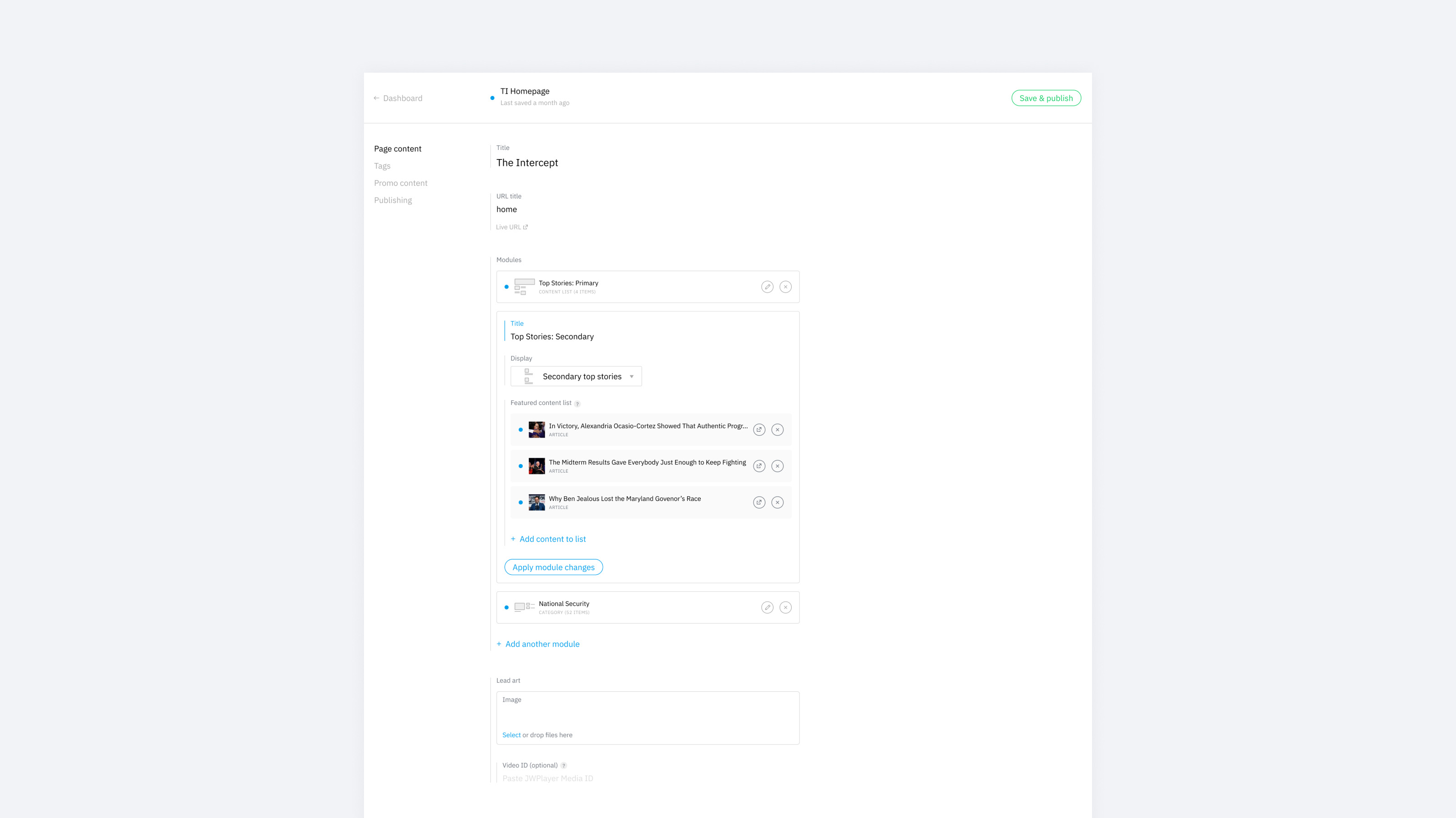
We launched the homepage editor using the same components in different ways to accommodate Topic’s flexible layout and The Intercept’s fixed layout within the same CMS. Any future homepage needed to be brought into Falcon will fall into one of these two types of homepages, so Falcon’s homepage editing system is now scalable.
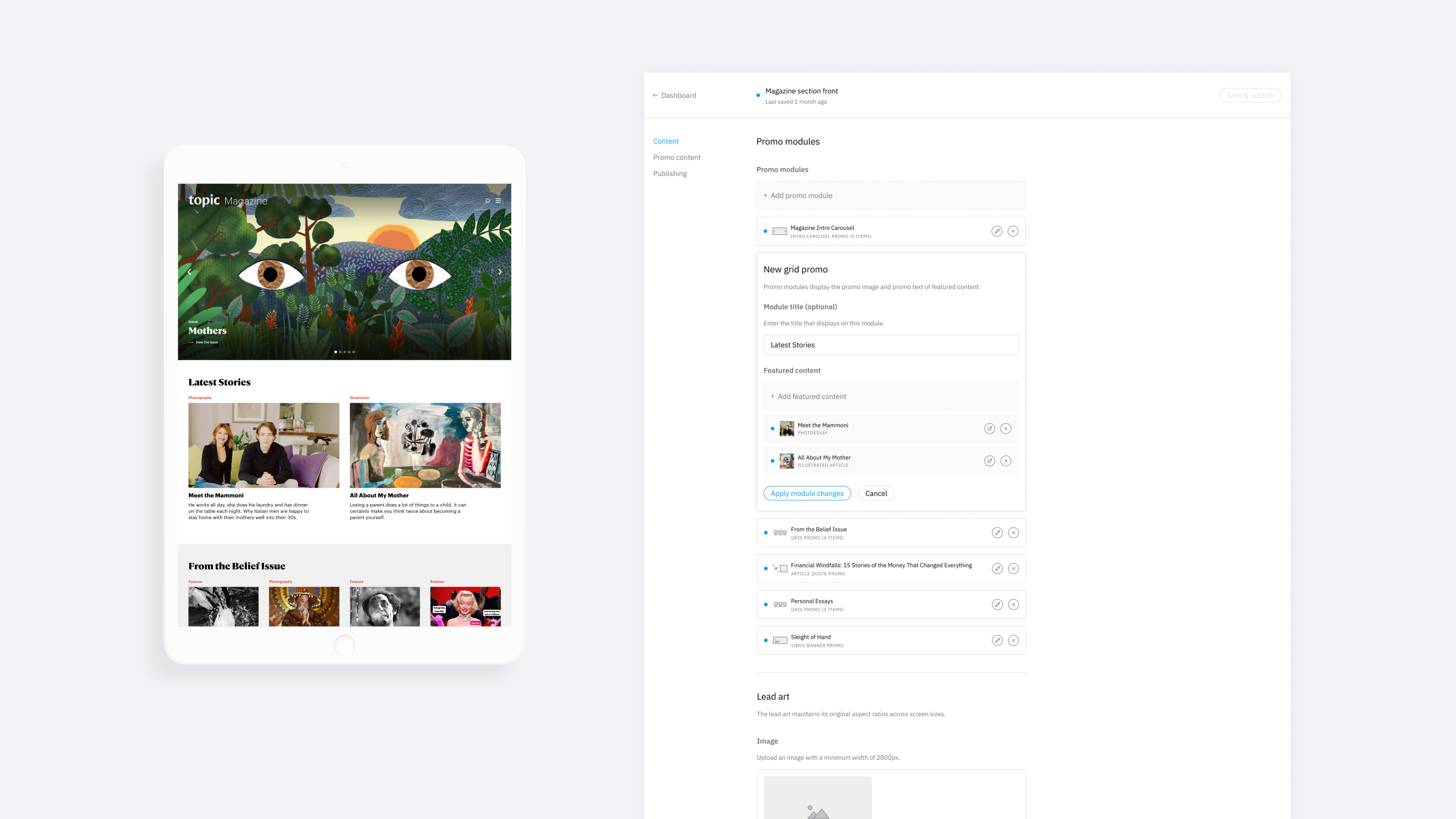
The new homepage editor of Topic, for a flexible layout.
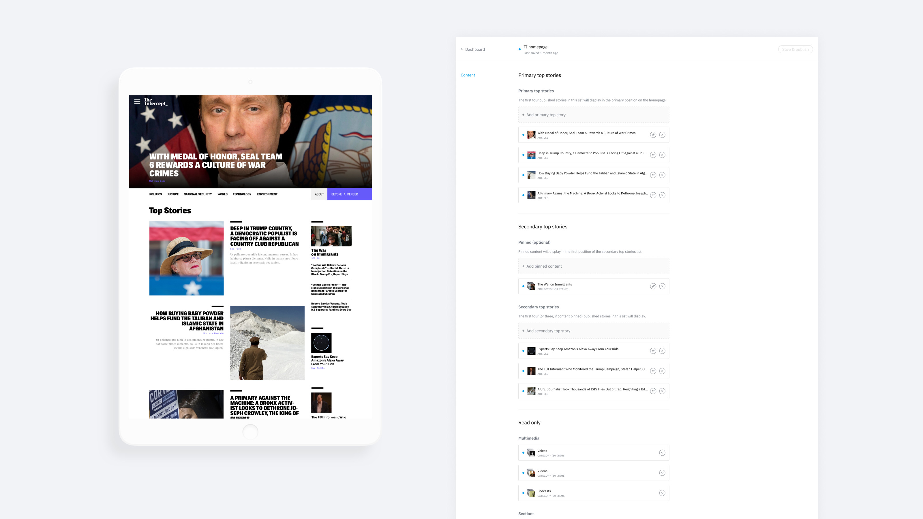
The new homepage editor of The Intercept, for a fixed layout.
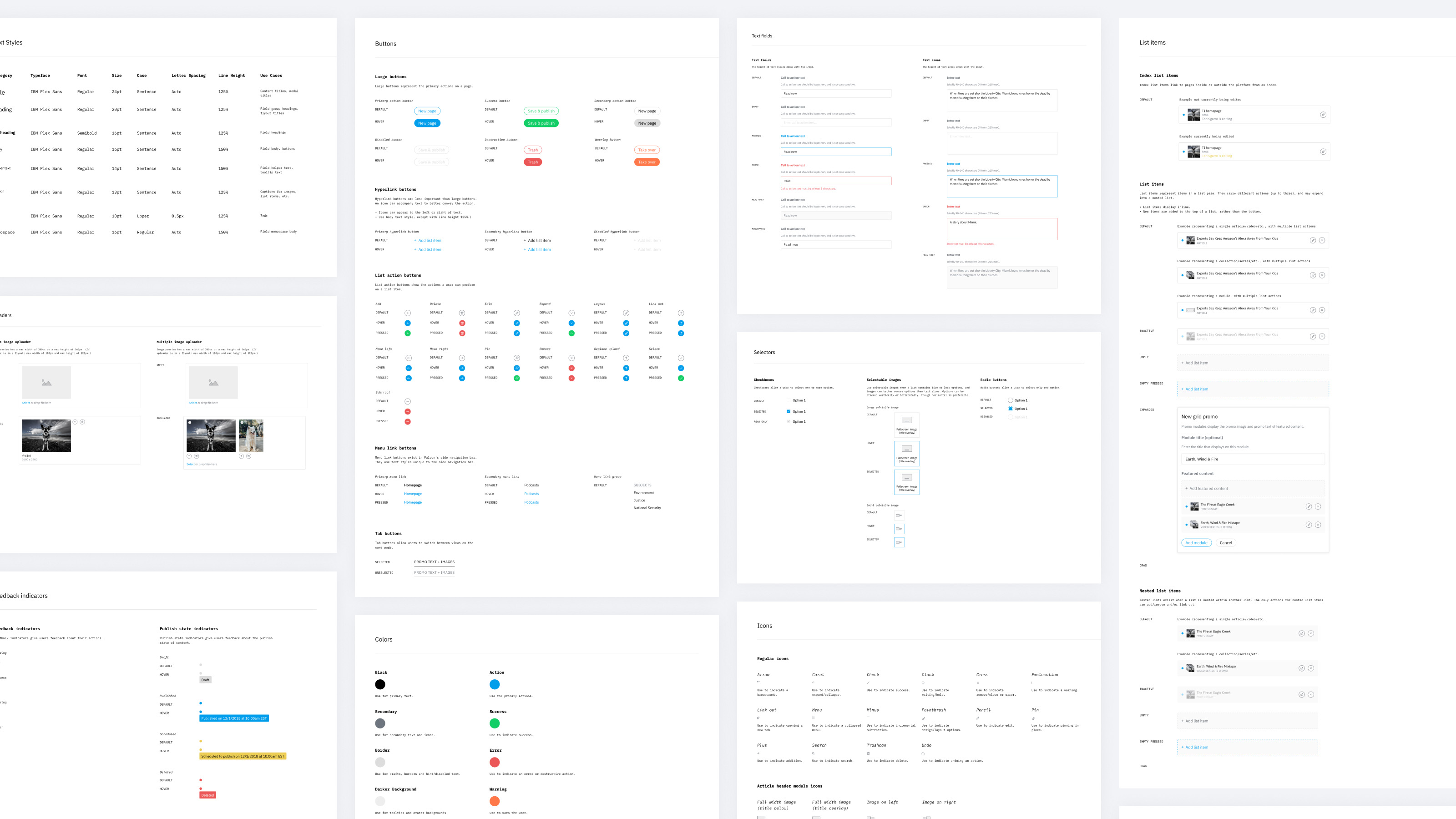
Design System
While working on this feature, I saw a need for documenting a design system – both for myself and the design team, and for engineers. I started more or less at ground zero: there were some patterns used throughout by engineers, but no product manager was assigned to Falcon, and not much work had been done on the design of the platform. This was an opportunity in a lot of ways, because I faced no red tape, and developers weren’t attached to Falcon’s existing design.
I started by documenting existing components, and then made improvements or created new components as they became needed in my feature work. Engineers will continue to build out the new design system’s components as they’re needed for the features we’re developing: list management (shown here), image management, and promo image cropping. Since Falcon is an internal product rather than a consumer product, we can roll out these changes gradually and some inconsistency across screens doesn’t affect a “brand.”